Pages

Monday, August 30, 2010

Body Hotel - Thomas Schaeben & Schad Privat

Body Hotel - Thomas Schaeben & Schad Privat: from Computerlove


76535497_640.jpg

Body Hotel by Thomas Schaeben & Schad Privat (remix by COMA)
Directed & produced: David Lüpschen

Augmented City 3D

Augmented City 3D: from Computerlove


83640872_640.jpg

The architecture of the contemporary city is no longer simply about the
physical space of buildings and landscape, more and more it is about the
synthetic spaces created by the digital information that we collect,
consume and organise; an immersive interface may become as much part of
the world we inhabit as the buildings around us.


Augmented Reality (AR) is an emerging technology defined by its ability
to overlay physical space with information. It is part of a paradigm
shift that succeeds Virtual Reality; instead of disembodied occupation
of virtual worlds, the physical and virtual are seen together as a
contiguous, layered and dynamic whole. It may lead to a world where
media is indistinguishable from 'reality'. The spatial organisation of
data has important implications for architecture, as we re-evaluate the
city as an immersive human-computer interface.
~Keiichi Matsuda

keiichimatsuda.com

Hurley x Livery Design Gruppe x Dalek Fixed Gear Bikes


Hurley x Livery Design Gruppe x Dalek Fixed Gear Bikes 

from highsnobiety.com

Hurley x Livery Design Gruppe x Dalek Fixed Gear Bikes
Another noteworthy piece seen at the Hurley Campus in Huntington Beach was a collaborative bike series with Livery Design Gruppe.
“Featuring a geometrically vivacious blend of color and form, these bikes showcase the artwork of world-renowned artist Dalek (James Marshall). These rolling art pieces were commissioned by Hurley to compliment their ultra high-end line of Phantom boardshorts and swimwear.”
The bike pictured above is being raffled off at the US Open of Surfing in Huntington Beach, CA this weekend.
Take a leap for more photos of the Hurley x Livery Design Gruppe x Dalek Bikes.

Designs on your money

Designs on your money: from CR blog
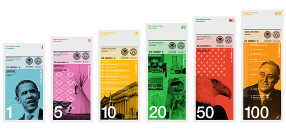
The work of 'communists' or 'tea-drinking fancy pants Limeys'? The reaction to studio Dowling Duncan's submission to the Dollar ReDe$ign Project proves that even speculative work on currency design is guaranteed to provoke strong opinion...

The studio's designs for the $1, $5, $10, $20, $50 and $100 bills were submitted earlier this month to the Dollar ReDe$ign Project, the ongoing open submissions scheme organised by New York designer Richard Smith to rebrand the US dollar.


But Dowling Duncan's designs, where each image directly relates to the value of each note, have put a fair few Republican noses out of joint – see here and here, for example – with some bloggers annoyed at British interference (despite the fact that the company is a bipartite studio with offices in Newark, England and San Francisco).


Aside from featuring the five biggest native American tribes ($5); the first 10 amendments (aka the Bill of Rights) to the US Constitution ($10); the 50 States ($50); and highlights from 20th Century America ($20); the designs proving the most controversial are, understandably, those with a more political bent.

Dowling Duncan's proposal for the $1 bill features President Obama (the link to the note's denomination is through Obama being the 'first' African American president). And the $100 note acknowledges President Franklin Delano Roosevelt's first 100 days in office, where his passing of unprecedented legislation attempted to combat the effects of the Great Depression during the first half of 1933.

Did the studio expect the designs to generate such a reaction? 'No, not really,' the designers maintain. 'We wanted to challenge people's perceptions about what the dollar should be or could be, but putting Obama on the $1 bill seems to be the major talking point.

'The general feedback about the design and content has been great, but there have been some who have reacted badly to it all. We appreciate people being extremely passionate about this and to change something which has been around for a such a long period of time takes some getting used to... We've had direct emails from people voicing their dismay and disappointment and messages left on our studio answer machine from people saying they would rather leave the States if our notes ever saw the light of day. The reaction personally towards Obama has taken us a bit by surprise.'

The set of six notes is unashamedly celebratory: the $20 bill celebrates 20th century America and features Buzz Aldrin, the grille of an old Ford, an early radio, for example. But, while speculative, clearly the other ‘achievements' aren't to everyone's taste.


'When we researched how notes are used we realised people tend to handle and deal with money vertically rather than horizontally,' Dowling Duncan explain. 'You tend to hold a wallet or purse vertically when searching for notes. The majority of people hand over notes vertically when making purchases. All machines accept notes vertically. Therefore a vertical note makes more sense.'

Dowling Duncan's notes are also sized more like the Euro (the bigger the note the higher its value) and while the Greenback also currently sports that big purple digit (as reproached here by designer Michael Bierut) the studio's redesigns are brightly coloured, decidely modernist and, perhaps of particular annoyance to some US bloggers, rather European looking.

'I think people appreciate our concept, like the design, format and general look of the bills,' say the designers. 'But it's our choice of two democratic Presidents, whom some believe have not helped the US economy enough in it's time of greatest need that has got people's backs up – unintentionally we might add. Also some aren't happy that a couple of 'tea drinking fancy pants Limeys'* (as we were described) have had a go at redesigning their currency.'

*The eloquent Southern Beale blog nicely (and ironically) summed up the kind of reaction such designs might receive from more conservative bloggers, as being the product of 'tea-drinking fancy pants Limeys'.

But has there been any feedback from Obama himself as yet?

'No, we've tried desperately to get to him but as you can imagine he is a hard man to reach,' say the studio. 'We've been told by some good sources that he would have seen it, but for him to comment on it would really ignite the debate and bring Richard's project to the forefront and into the mainstream. Also, he's on holiday at the moment!'


You can submit your redesigns of the US dollar bills at Richard Smith's website for the Dollar ReDe$ign Project. The submissions form is here. Deadline is 6 September.
More of Dowling Duncan's work is at dowlingduncan.com.

Sunday, August 29, 2010

Tuned Pale Ale

Tuned Pale Ale: from Polkadot
TunedpalealeWeb
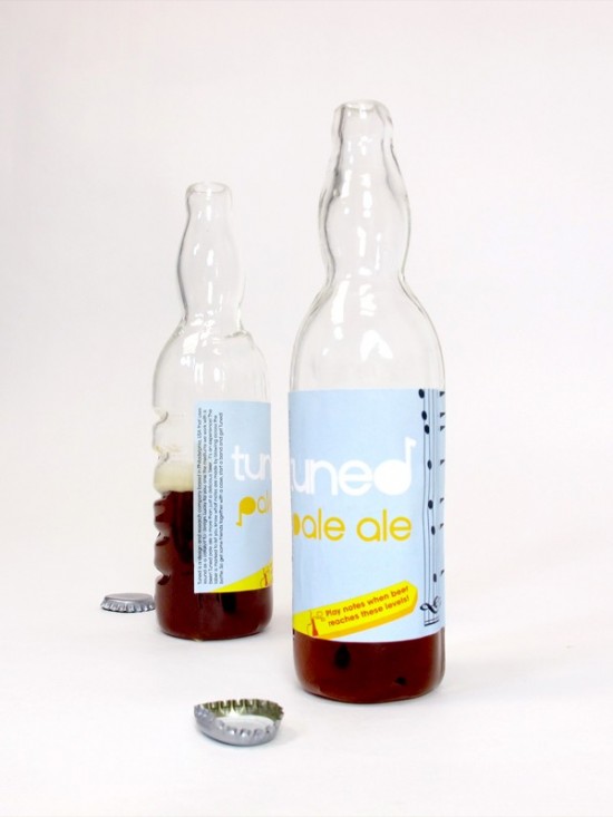
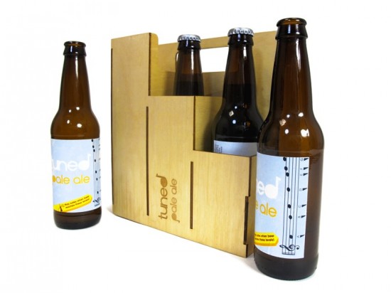
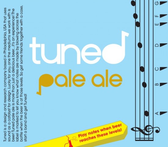
Tuned Pale Ale is a product that explores the musical affordances in everyday objects and promotes social spontaneity. While drinking beer, people become musically encouraged and often start making start making music with objects around them. This product aims to promote more of this type of social interaction. This product aims to inform users about the musical qualities of existing bottles and to make the bottle a better instrument.
TunedBottleWeb

6PackWeb

TunedBlowingWeb

Tuned6pkDrumWeb

Tuned-label

Saturday, August 28, 2010

Propellerhead Creates Worlds Largest Drum Machine

Propellerhead Creates Worlds Largest Drum Machine: from Polkadot


Propellerhead recently decided to create a giant, 4×4 light-emitting device so large that you have to literally jump between each of the pads in order to trigger the drum samples. Then they just randomly set up shop outdoors somewhere and hooked everything up to a projector showing the Kong drum synthesizer that it was hooked up to, and hundreds of people just stood there in awe.
Kong is a new instrument added in Reason 5, which by the way, has benn launched on 25th of August. It is a $129 upgrade if you currently own ANY previous version of the program, $349 if you are buying it for the first time, and $449 in combination with Record, which is also getting an update tomorrow. More info here! | via

Monday, August 23, 2010

United Snakes - Massive Attack

United Snakes - Massive Attack: from Computerlove


31939231_640.jpg
United Snakes is the music video from Massive Attack. Produced and directed by UnitedVisualArtists collective. A unique video, taking the approach of artists working on music video’s to its most direct level.

Film Production Apps

Film Production Apps: From scriptwriting to storyboard composers, iPad and iPhone assistants for all areas of filmmaking
As lightweight devices tailored for on-the-go activity, the iPad and iPhone has already made fans out of filmmakers who want to stay in touch on set. Increasingly, clever applications are turning these digital tools into integral parts of the filmmaking process itself. Below we highlight several apps that make production more efficient—from drafting a script to creating a storyboard and more.

appset6.jpg

Scripts Pro
The functionally sleek Scripts Pro screenwriting software allows you to create and edit new scripts, as well as open files created in Celtx (a free scriptwriting program) and the industry standard Final Draft on iPhones or iPads. When the app senses an external keyboard plugged into the iPad, it eliminates the touchscreen keyboard to maximize the view. An affordable alternative to Final Draft, Scripts Pro sells from iTunes for $6.


appset7.jpg appset8.jpg

Storyboard Composer
The finishing component to any good script is a storyboard. Cinemek's Hitchcock Storyboard Composer uploads multiple images from your libraries and adds them to the storyboard where you can arrange the photos and add audio, notes or scene-picker wheels. Once you've finished working with the images, the app compresses them into a PDF which can then be played back as a video. For a full scope on the Storyboard Composer's capabilities, check out the video. From iTunes for $20.


appsset4.jpg appset5.jpg

Artemis Director's Viewfinder
With an extensive catalog of lenses and camera types, Artemis Director's Viewfinder provides a great platform for realistically viewing the shot through your selected camera format. The viewfinder allows you to zoom in, compare lenses and play with the aspect ratio as well. Once you're happy with the shot, you can save it and upload to a storyboard or send it through email. From iTunes for $30.


appsset2.jpg appsset3.jpg

DSLR Slate
Along with using your iPad or iPhone to create and edit stories, you can also use it on set in place of an oft-costly clapperboard. Designed for use with digital cameras, DSLR Slate not only offers a running timecode and inputs for typical production items like 'scene,' 'take' or 'director,' but it also provides info on camera settings such as ISO speed, aperture, white balance and more, as well as syncing audio for dual-audio system shoots. From iTunes for $5.


appset10.jpg

Pro Prompter
For shoots that require a teleprompter, ProPrompter not only provides a customizable scrolling screen of text on the iPad (in either portrait or landscape modes), but it also syncs multiple iPads so the presenter is free look at various cameras at any time. The app also allows you to easily adjust the speed or loop the script for numerous takes. From iTunes for $10.

appset9.jpg tcoder-pc.jpg

TCoder
A tool geared toward journalists, TCoder runs alongside the camera, syncing the time code with any notes you are taking for reference later or to email to an editor. From iTunes for $4.

A day @ Freitag Headquarters

A day @ Freitag Headquarters: from Polkadot
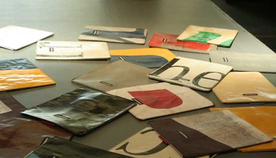
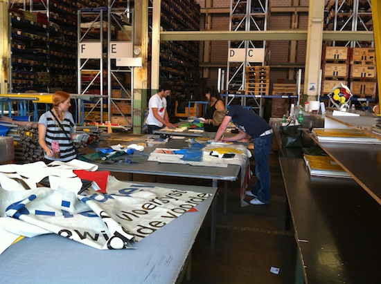
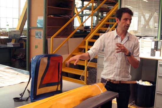
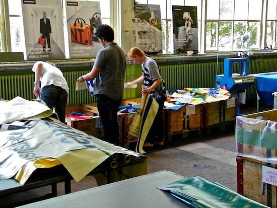
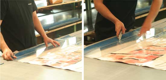
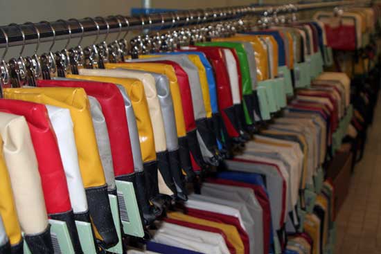
On late July I have been invited ( as Polkadot boss ;) ) with just a few handpicked European bloggers in the wonderful Zurich to visit the FREITAG headquarters including cutting our very own iPad sleeves and enjoying a night out with the FREITAG crew. It was an amazing experience, the guys @ Freitag are really super and we also had a chance to have a talk with Markus Freitag (one of the founders of the company). We will post the interview in the next few days.
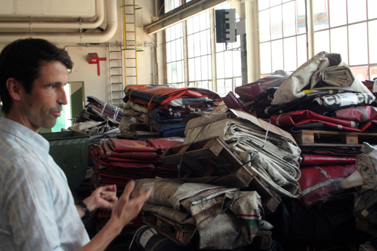
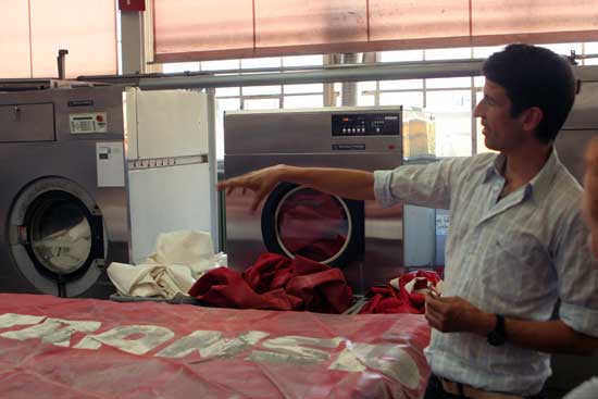
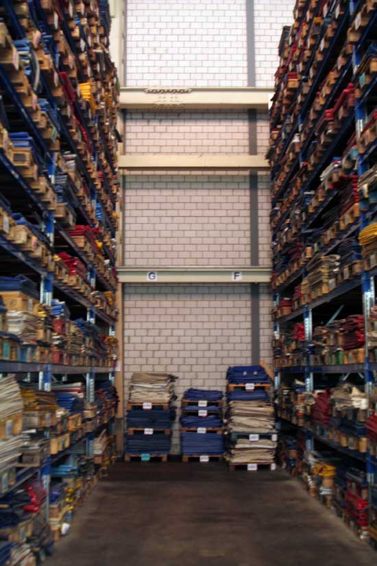
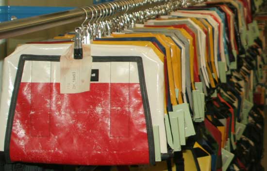
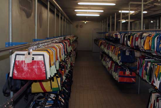
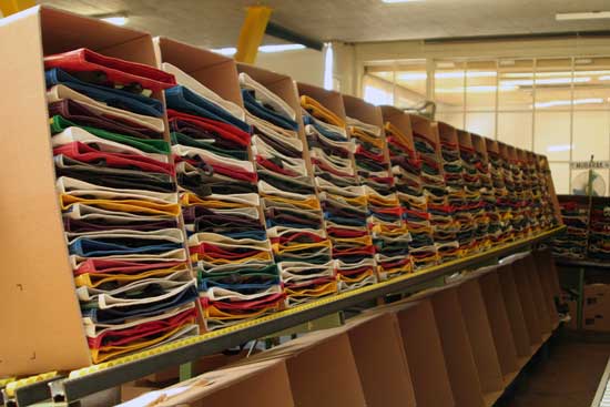
For the few who should not know the brand, FREITAG has been manufacturing bags and accessories for women and men since 1993. Their materials are used, having seen service on the road. They are well-travelled truck tarpaulins, unraveled seat belts, bicycle inner tubes beyond repair and recycled airbags. Tough stuff – which makes their products tough, too. The swiss company apply their recycled materials in a totally new way, insisting on superlative design and functionality. Every FREITAG product is made from original tarpaulins of different colors, markings and contours. So every FREITAG product is a one-off.

Freitag have just launched their beautiful iPad sleeves, complete with a ‘one-pull’ strap system for easy access, a ‘velvety’ inner lining, and their iconic recycled tarpaulin outers. We have been able to cut some pieces, and once they will be sewn together and will get our desk, we will give them for free to our readers, so stay tuned.

Cutting Ipad sleeves with the other bloggers Russel ( russelquinn.com), Marisa ( hopehope.ch)and Matthijs ( DoYouReadMe). Some pics are from their websites, so thank you guys ;) .


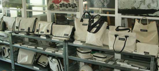
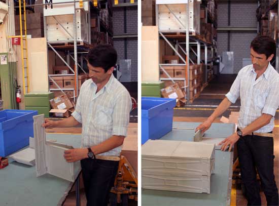
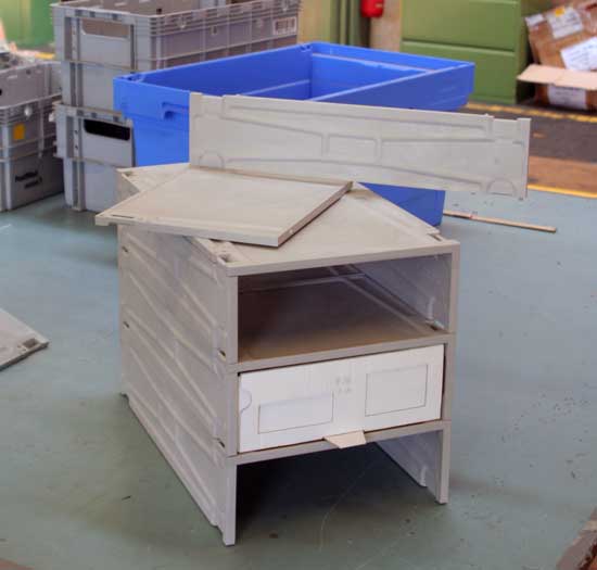
Freitag keeps an eye open to the applicable standards of durability and sustainability, even in the design field. With its modular structure, the «V30 FREITAG SKID» shelf system by Colin Schaelli was created as a customised sales shelf for thFreitag bags. An angular module made of recycled plastic forms the basic element of the system. With clips linking these modules, shelf systems of varying design can be configured to meet the needs of the shop in question. As the basic elements can easily be stacked, this offers further advantages for storage and transport purposes.


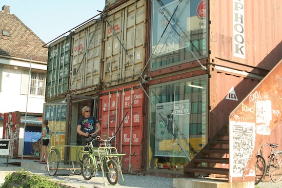
We also had a visit at the Zurich Freitag shop, which is made of seventeen used freight containers stacked together, “used Type 20/8/86 ISO1CC Type Steel Dry Containers”, properly speaking. (Architects: Spillmann Echsle ). The base is used as a sales outlet, while the tower has become a striking landmark between two main international transportation routes. Inside, steel staircases provide entry to four levels of display space, which showcase all the Freitag products.

Thursday, August 19, 2010

Beyond the Screen: Teaser from Mapping Festival Documentary, Good Visualist Times

Beyond the Screen: Teaser from Mapping Festival Documentary, Good Visualist Times:

Just two minutes in length, a teaser from a new documentary on the Mapping Festival encapsulates the growing range today’s visualist can cover. Far from look-alike video loops projected on narrow rectangles, that gamut extends to mapping and human performance that explodes the screen, from advanced, special-effects-laden cinema to abstract visual design. The video is appropriately titled: these are, simply, artists working in light, exploring with that light the concepts of rhythm and space long exploited by music and sound.


cam op / editing : jerome monnot
extra cams : vania jaikin miyazaki / ilan katin / camille dedieu / boris edelstein
music taken from 'ancestors' by Gonjasufi - prod by flying lotus

mappingfestival.com
... documentary in pre-production

Visualist Controllers: Codanova’s Drool-Worthy V64, Beer-proof Active8

Visualist Controllers: Codanova’s Drool-Worthy V64, Beer-proof Active8: from Create Digital Motion

Somehow in May, I missed the introduction of Codanova’s VMX V64. With a huge jog wheel in the center, button grid, and lots of faders and knobs, it presents an interesting, visualist-friendly MIDI controller alternative to Livid’s Ohm64. Like the Ohm64, it takes the square button trigger design cue from the monome, but eschews that hardware’s minimalist, button-only approach for some other controls. Also like the Ohm64, while it could easily work as a music controller, you can instantly see that it was designed by people who use visual software. (Indeed, vvvv, GrandVJ, Resolume Avenue 3, and Modul8 are called out by name in the announcement.)
Specs:
121 fully assignable controllers

matrix button de 4×16

2×16 potards

8 sliders

16 touch note on note off

1 jog weel

2 crossfaders

Power supplied by USB port
Come on, no snickering about “potards.”
Even more striking is the indescribably bizarre teaser video for the VMX Active8, a future, touch-sensitive controller. (Long-time followers of this stuff will instantly recognize some similarity to the ill-fated Midiman Surface One, a similar touch controller from the company that became M-Audio that never made it past the prototype phase. Apparently, that prototype is still floating around somewhere, but cost and engineering problems prevented the gear from being practical.)
I’m pleased to see the cliche of VJ babes be replaced by something … um … much stranger.
And the controller itself looks pretty fantastic. That beer-proof quality, if it works as advertised, has some distinct advantages. VMX Active8 is a prototype for visual software Modul8.


VMX? vvvv? DMX? VDMX? Vidvox? You almost get the sense that someone spilled beer on their (non-beer-proof) QWERTY keyboard in this field, huh?
And yes, I’m way behind on this. So, come on, CDMotion readers, send those tips in! (CDMusic is usually more on top of things because I hear more often from the readers!)

Visual Acoustics Theatrical Trailer

OMG the Future is Now

OMG the Future is Now: from The Beatery
Crafty people have done some amazing things with digital DJ control surfaces, but this really takes it to the next level. I want one.
The surface is rear projection on a glass plate with multi-touch capabilities. It seems like a really awesome way to show people that you are actually crafting beats up there, and not just checking your email.

“emulator” on töken concept from yöyen munchausen on Vimeo.

Saturday, August 7, 2010

V Pomparkour Ladder Sport


I guess this is another option to end your life faster! Please don't try this at home. These guys are well trained.

Extracts of Local Distance

Extracts of Local Distance: from Motionographer


Extracts of Local Distance. sweet custom software = common vanishing point image resynthesis from architectural imagery. starts getting extra fun around 1:35 (thanks handshake!)

Interactive Architecture: Behind the Scenes with Modular, Proximity-Sensing Display Tiles

Interactive Architecture: Behind the Scenes with Modular, Proximity-Sensing Display Tiles:


Brooklyn-based interactive artist Robert Stratton writes to share his interactive, modular LED display system, currently on view through the end of August in a window on 53rd Street in Manhattan, between 5th and 6th across from the Museum of Modern Art. The project uses proximity sensors built by Sensacell.
This installation is an interactive l.e.d. triptych on display on 53rd St bet 5th and 6th through August 2010. Children were prompted to make various expressions and funny faces. The video plays on two layers and participants can manipulate rectangular “holes” in the upper layer to partially reveal the video in the lower layer, creating a portrait of a hybrid person conveying a hybrid emotion.
This kind of installation has gone from being a novelty to a sort of medium in itself – and perhaps a new venue for visualist work. So I asked to hear more about how Bob put together the project and what he learned. He responds for CDM:
As I mentioned, the interactive modular L.E.D. system is made by my friends at NYC-based Sensacell Corporation. There is tons of information about their offering and the technical specs on their system on their site at www.sensacell.com but basically, they make modular L.E.D. tiles with built-in capacitive proximity sensors. I’ve been working with them doing content and display software for each successive version of the system since they started in the early 2000s (I was a partner with one of the principles, Leo Fernekes, in the technology/surveillance-themed nightclub Remote Lounge in the early part of the decade). The tiles can work in various “autonomous modes” where they simply light up when the sensors are triggered or (and this is where I come in) one can write software to read the sensors and to send display data to the tiles. I started Madbutter (www.madbutter.com) as a design and programming studio to develop content and programming for these interactive installations earlier this year. I’ve gotten a lot of favorable attention for the pieces I have done so far but I’m still looking to get the word out on the capabilities of this system to architects and designers looking to install interactive art that can work reliably and effectively at this “architectural” scale.
The current version of the system that I am using here is based on 6″ square tiles which has full RGB LEDs set at an inch pitch – for 36 independently addressable LEDs per tile – and 4 proximity sensors. These can be arranged into arrays (or irregular shapes for that matter) of virtually any size. We have put them in floors, in and on walls, in windows, in furniture, around pillars etc. The general idea is to layer the tiles with a translucent, non-conductive surface that protects the tile and diffuses the LED slightly. In the case of this installation the tiles are fully interactive through a half inch of frosted plexiglass and a quarter inch of plate glass.
I wrote the display system in Max/MSP/Jitter. I worked with Sensacell to develop a custom box (we call it a SensaNode) that sends to my control computer, over TCP/IP, the polled sensor data of the whole tile array as a Jitter matrix and also in turn reads in a matrix of display data sent from Jitter to cut up and process and route to the individual tiles. Currently we are comfortably and reliably getting 20 fps I/O on our read/write cycle, so I author display data accordingly. Because the pixel pitch is relatively large, the combined triptych (three 4 foot wide by 6 foot tall panels) in the 53rd St installation uses only a 144×72 display matrix, and the sensor matrix is only 48×24, so it is important to author content that is effective at that resolution! More importantly, of course, is to come up with interesting and immediately apparent ways to use the incoming sensor matrix to manipulate the outgoing display data in real time. I usually use some computer vision externals (the excellent cv.jit package) to process the sensor data to give me centroid or blob coordinates that I can use to interactively track some value I can manipulate in Jitter.
Aside from this particular work, I’m very intrigued in the potential of the technology and how a variety of artists might push it in different directions. I hope we can get a discussion going here; do join in.

Thursday, August 5, 2010

Requiem for a Thought

Requiem for a Thought:
Text message in the thoughts of the strange character lurking along the wall. The interactive bubble reveals the characters inner thoughts, as it tracks the characters movements. A collaboration piece between Paul Notzold’s TXTual Healing and Jared Gradinger with Pictoplasma. This piece was made during Les Grandes Traversees festival in Bordeaux France in July of 2010.