Pages

Monday, November 28, 2011

Airside to close in March

Airside to close in March:re-blog from CRBlog


Airside is to close its doors in March 2012 after 14 years in business. The studio, which made its name originally for website design and animation, says the decision is a 'voluntary' one reached jointly by the founders Alex Maclean, Nat Hunter and Fred Deakin

Airside opened in 1998. In a joint statement issued today, Maclean, Hunter and Deakin say "For the record, we aren't going bust, in fact we're currently thriving. We haven't fallen out with each other, in fact we're as close as we ever were. What has happened is that after 14 years of working together, we have grown into different people with different goals. Despite all of our best efforts we can't see a way for Airside to move forward and accommodate all of our individual ambitions. You could put it down to musical differences if you like!"


Airside founders (from left) Deakin, Maclean and Hunter when they started in 1998 (left) and now

The statement goes on to say that "We feel that it is completely true to the unique spirit of Airside to end the company as friends and to end it on a high. We'll be making an announcement as to our individual future plans nearer to March 2012 when we close, and there will of course be a party to mark our closing. Between now and then we'll be focused as always creating amazing work for our clients and ourselves - this is the last chance for us to work together as Airside. Although we definitely plan to collaborate in future."

During Airside's 14 years it has won many awards, including a Cannes Grand Prix and two Best in Books in the CR Annual. It was one of the first significant digital studios to emerge following the dot com crash of the late 90s and quickly gained a reputation for creative excellence. The company currently has nine staff. Its Tokyo branch, Airside Nippon, "will continue to trade as normal," the company says.


From Airside by Airside, a book celebrating the studio's tenth anniversary

Read our feature on the company's tenth anniversary here

Our sister title Design Week has more on the story here

Those Olympic posters: some alternatives

Those Olympic posters: some alternatives:re-blog from CRBlog


Earlier this month, 12 posters by leading artists for the 2012 Olympics and Paralympics were unveiled to a largely skeptical public. Given the same brief, Kingston University students have come up with their own versions

Over the current term, I have been doing some lecturing with the third year students on Kingston University's graphic design and photography courses. A couple of weeks ago, following the release of the 2012 Olympics artists posters, course director Rebecca Wright and I asked the students if they would like to respond to the same briefy given the artists. We asked them for a personal response to the idea of the London Olympics and the intersection between art and sport. Here are their responses.


Leanne Bentley and Ben West came up with this cheeky and somewhat damning response to the artists involved with the official series: DNF stands for Did Not Finish, the ultimate Olympic fail.


For her poster, Ran Park overlayed images of athletes performing various sports to create this beautiful composition


A lot of the student responses were quite critical or dubious about the supposed benefits of the Games coming to London. Here Libby Wimble compares LOCOG's ambitions to those of a Stalinist Five Year Plan: presumably she feels they have as little basis in reality as each other. The background to the poster is made up of 250,000 tiny tractors


Rosie Palmer and Helen Ferguson were also dubious, focusing on the terrorism threat


Tamara Elmallah was concerned about all the overcrowding the games will bring to the Tube, overlaying an image of spectators rendered in all the Olympic colours until it becomes a brown sludge of humanity


And Alice Tosey wants us all to 'mind the gap'


And Paul Chanthapanya points to the insidious nature of sponsorship at the Games


While Stephen Messham points out that suffering in the world will not go away just because the Games are in town


Others, though, chose a more positive view. Benji Roebuck and Clara Goodger created their poster from the word for 'hello' in the languages of competing nations, allowing the ink from one word to run into another suggesting the coming together of different nations at the Games.


Coming together is also the theme of Jo Hawkes' poster


And this cut paper piece by Fred North


Hannah Parker had a neat idea for a digital display in which segments would gradually appear over a period of time running up the opening of the Games until the image was completed


Maddy Whitty's rather beautiful image of the madding crowd of spectators was created using jelly beans


Sam Carroll plays with those famous rings


While Signe Emma created this image from tape which she then photographed


Sophie Burt reminds us of the different races taking part in the games


While Felix Heyes, Josh King, Paul Nelson and Ben West cleverly capture the excitement of the starting block


The same team (minus Paul Nelson) also came up with this wonderfully witty idea. 'Who's there? The Olympics!'


Thanks to all the students who took part. They only had just over a week to come up with these, alongside all their other work. Set alongside the efforts of our illustrious artists, I think there are some worthy contenders here.

Read our opinion piece on the official 2012 Olympics posters here

Sunday, November 27, 2011

Ned Wenlock: “Apache” for Danger Beach


Apache from oneedo on Vimeo.

Ned Wenlock: MGMT “All We Ever Wanted Was Everything” โคตรเจ๋ง!

Ned Wenlock: MGMT “All We Ever Wanted Was Everything


MGMT - All We Ever Wanted Was Everything from oneedo on Vimeo.


In Ned Wenlock’s new music video for MGMT’s cover of Bauhaus’s All We Ever Wanted Was Everything, he further explores the techniques used in his earlier music video for Danger Beach’s Apache. Ned cleverly highlights the surreal lyrics with custom typography that becomes our guide through a dreamy, ever-unfolding (or is it un-curling?) world.

Ned has been kind enough to share some development imagery with us. More info on the concept and process at Ned’s blog.
Taken from the album Late Night Tales – MGMT

Info at latenighttales.co.uk

Directed by Ned Wenlock

Character Animation by Rodney Selby

Produced by Georgiana Taylor

Tuesday, November 22, 2011

Benetton wants the world to UNHATE

Benetton wants the world to UNHATE:re-blog from CR Blog


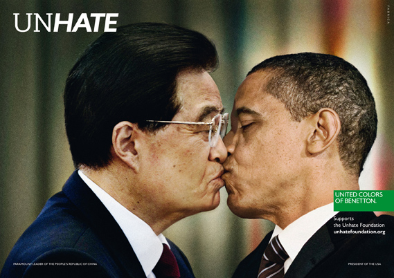
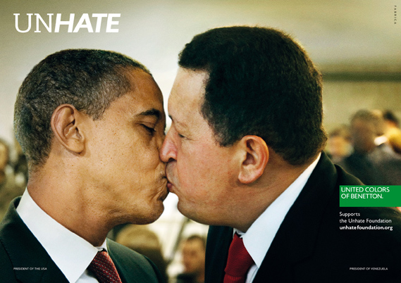
A new campaign from Benetton recalls the brand's controversial heyday. A series of posters features world leaders with lips locked to launch the UNHATE project

Benetton, says the accompanying press material, is inviting "the leaders and citizens of the world to combat the 'culture of hatred'". The UNHATE campaign is the first initiative from a new Benetton foundation of the same name, launched by Alessandro Benetton, executive deputy chairman of the Benetton Group.


A series of posters, created by Benetton's 'research communication centre' Fabrica in cooperation with 72andSunny, features political and spiritual leaders kissing (shown above, The Pope and Ahmed Mohamed el-Tayeb, Imam of the Al-Azhar mosque in Cairo. Below, US President Barack Obama and Hugo Chavez of Venezuela)


According to Benetton "These are symbolic images of reconciliation - with a touch of ironic hope and constructive provocation - to stimulate reflection on how politics, faith and ideas, even when they are divergent and mutually opposed, must still lead to dialogue and mediation."


Palestinian President Mahmoud Abbas and the Israeli Prime Minister Benjamin Netanyahu


German Chancellor Angela Merkel and French President Nicolas Sarkozy


North Korean Supreme Leader Kim Jong-Il and South Korean President Lee Myung-bak

There is also an accompanying film by director Laurent Chanez.


Plus social media activity including the Kiss Wall where users can upload images of themselves kissing.

Agency: Fabrica in cooperation with 72andSunny NL
Creative Director/Writer, 72andSunny: Carlo Cavallone
Creative Director/Designer, 72andSunny: Paulo Martins
Design Director/Partner, 72andSunny: Robert Nakata
Creative Director/ FABRICA: Erik Ravelo

Update: Following pressure from the Vatican, Benetton has reportedly withdrawn the poster featuring the Pope kissing Ahmed Mohamed el-Tayeb. Vatican spokesman Fr Federico Lombardi has been quoted in various sources criticising the company for exploiting the Pope's image.

"We must express the firmest protest for this absolutely unacceptable use of the image of the Holy Father, manipulated and exploited in a publicity campaign with commercial ends," he said. "This shows a grave lack of respect for the Pope, an offence to the feelings of believers, a clear demonstration of how publicity can violate the basic rules of respect for people by attracting attention with provocation." Benetton has apologised.

The Bloody Beetroots feat. Dennis Lyxzén (Refused) – Church of Noise

The Bloody Beetroots feat. Dennis Lyxzén (Refused) – Church of Noise:


The Bloody Beetroots versus Dennis Lyxzén (Refused, The International Noise Conspiracy, etc) – what sounds like an epic collaboration at first sadly turns out to be a cheesy Digitalism clone with hardcore punk vocals. This is the new shit? Hopefully not.


The Bloody Beetroots – Church of Noise (feat. Dennis Lxyzén)

Not even the pathetic video really makes up for four minutes and two seconds of music that would’ve been cool two years ago. At best, this song will be added to my personal list of tracks that have sounds in it that resemble certain notification sounds – as in that particular case, the sound of a BlackBerry receiving a new text.

A Museum’s Faceless Cube, Transformed: Mapping in Austria

A Museum’s Faceless Cube, Transformed: Mapping in Austria:


MQ10 | Architectural staging from urbanscreen on Vimeo.


Speaking of projection mapping (again), Jonas sends a project he worked on that’s a spectacular example, one that seems to make a faceless box of a museum extrude fragments from its side and gain new depth. Description:

An audiovisual staging of the Leopold Museum’s architecture during the 10th anniversary of the MuseumsQuartier in Vienna, Austria.

Premiered on 30th of July in 2011.

Art Direction: Daniel Rossa (rossarossa.de), Till Botterweck

Technical Director: Till Botterweck

3D Operator: Peter Pflug

Sound Design: Jonas Wiese

Documentation Director: Thorsten Bauer

Camera: Thorsten Bauer, Moritz Horn, Oktocam Vienna (audiovisuellemedien.at)

Edit: Jonas Wiese

Commissioned by: Soundframe Festival (soundframe.at)

Realized with Wings VIOSO Mediaserver (vioso.com)

An URBANSCREEN.com production

Wednesday, November 16, 2011

Erick Oh: How to Eat Your Apple

Erick Oh: How to Eat Your Apple:


We are a bit late to the game on How to Eat Your Apple, a surrealist gem by Erick Oh, but it still tastes great! More treats await on Erick’s blog and his Vimeo, like Way Home and the trailer for Heart.

Learn more about How to Eat Your Apple at Short of the Week’s interview.

Found via Stash 86.

How to eat your Apple from Erick Oh on Vimeo.


Nathan Love for Sweet N’ Low

Nathan Love for Sweet N’ Low:
Nathan Love never fails to deliver. In a style reminiscent of ’60s and ’70s pop art, the gang whips up a playful two spot package for everyone’s favorite saccharine sweetener, Sweet N’ Low. In Cloud Rainbow and Sun Moon, viewers go back in time to an illustrative style evocative of such psychedelic artists as Heinz Edelmann and Peter Max. The Director of the spots, Anca Risca, elaborates:

“This project was alot of fun! As a first-timer directing a 2D spot, it was exciting to see it all come together and to be a part of the process.

The first step we took was to visualize the scripts into design frames, which were inspired by (and designed to be cohesive with) Sweet’N Low’s previous pattern-heavy print ad campaign. As we began fleshing out the storyboards and animatics, we brainstormed different ideas for the gags and details of the story. What does a cloud store between his puffs alongside his precious zero calorie sweetner? Sugary cupcakes? A horn or drumset? A lamb or a cloud-shaped sheep? The creative felt very freeform, and with such a well established brand it was refreshing to do away with the traditional commercial product end tag and incorporate it more into the story.

Music for this project was also a big factor for me- I really wanted to capture the light-hearted feeling that these characters carried, and I thought of laid back ukulele music as my instrument of choice.

With a dream team of only 3, animation and finishing happened quickly and smoothly, after which we all had cake and beer! Yaaay.”


Johnny Woods and Dpony VHS Movie/Album

Johnny Woods and Dpony VHS Movie/Album:

Dpony Movie is available on VHS tape in a limited edition of 100 copies.
Orders are available now for the price of $19.99 (including shipping and handling, USA only)


Sunday, November 13, 2011

“Graphic Design: Now in Production” exhibition

“Graphic Design: Now in Production” exhibition:re-blog from The Art of Title


This Saturday, October 22, the Walker Art Center in Minneapolis will open Graphic Design: Now in Production, a joint exhibition with the Cooper-Hewitt, National Design Museum.

The exhibition features work produced since 2000 in the most vital sectors of communication design, exploring the world of design-driven magazines, newspapers, books, and posters; the expansion of branding and identity programs for corporations, subcultures, and nations; the entrepreneurial spirit of designer-produced goods; the renaissance in digital typeface design; the transformation of raw data into compelling information narratives; and the storytelling potential of film and television title sequences.

For the latter section, Art of the Title was asked to guest curate a 'screening room' for the titles section of the show, and for the past ten months we've worked to produce a comprehensive list of film and television title work created within the last ten years that exemplifies contemporary title design.

Twenty eight sequences were chosen, representing both US and international film and television, from studios such Prologue, Imaginary Forces, Digital Kitchen, Elastic, yU+co., Lobo and MK12, and designers like Gareth Smith & Jenny Lee, Kuntzel+Deygas, Daniel Kleinman, Tom Kan, Jamie Caliri and Johnny Kelly.

With this wide variety of sequence choices we hope to highlight work that has influenced the design field, shown creative vision and use of materials, innovative practices and methods, and which embodies the timeless tradition established by past eras of title design.

A comprehensive, illustrated catalogue produced by the Walker Art Center accompanies the exhibition. The title sequence section will contain a specially commissioned introduction from Ben Radatz, Partner and Creative Director at the Kansas City-based MK12 (Stranger Than Fiction, The Kite Runner, Quantum of Solace) as well as write-ups and interview excerpts from Art of the Title.


Exhibition catalog


We would personally like to thank Andrew Blauvelt at the Walker and Ellen Lupton at the Cooper-Hewitt for this opportunity. It has been a tremendous honor to work with them on this and we are extremely proud and excited to be present for the opening.

Further details can be found here: http://calendar.walkerart.org/canopy.wac?id=6189


ABOUT THE EXHIBITION

The first major museum exhibition on graphic design in more than a decade, Graphic Design: Now in Production will run from October 22, 2011 - January 22, 2012 in Minneapolis and then travel to New York in the summer of 2012 and other venues thereafter.

Curatorial Team:

Ian Albinson, Art of the Title

Andrew Blauvelt, Walker Art Center

Jeremy Leslie, magCulture

Ellen Lupton, Cooper-Hewitt, National Design Museum, Smithsonian Institution

Armin Vit and Bryony Gomez-Palacio, Brand New

Graphic Design: Now In Production is co-organized by the Walker Art Center, Minneapolis, and the Smithsonian Institution’s Cooper-Hewitt, National Design Museum, New York.

Walker Art Center

1750 Hennepin Avenue

Minneapolis, MN 55403

1-612-375-7687


http://www.walkerart.org/


Walker Art Center


WRITER: Ian Albinson

WALKER IMAGE: j. fo (flickr)

LAST UPDATE: October 19, 2011

© Art of the Title, 2011


Full details for our “Graphic Design: Now in Production” exhibition post are available at Art of the Title.

The Title Design of Saul Bass (a brief visual history)

The Title Design of Saul Bass (a brief visual history):


The Title Design of Saul Bass from Ian Albinson on Vimeo.


To celebrate the release of the long-awaited book Saul Bass: A Life In Film & Design, I put together a brief visual history of some of Saul Bass's most celebrated work.


Saul Bass: A Life In Film & Design, by Jennifer Bass and Pat Kirkham, is available on Amazon.


The Museum of Modern Art (MoMA) will also celebrate the life of Saul Bass with a film screening and talk on Monday, November 14, 2011, at 7:00 p.m. This special event features the New York premiere of Saul and Elaine Bass's Academy Award-winning short Why Man Creates (1968), newly preserved by the Academy Film Archive, as well as a rich selection of title sequences, commercials, and corporate campaigns.


Among the evening's guest presenters are the book's author, Pat Kirkham, a distinguished design historian who knew Bass personally; Chip Kidd, the award-winning contemporary graphic designer and writer noted for his brilliant book covers; and Kyle Cooper, a legendary graphic designer in his own right, with such unforgettable film title sequences as Se7en, X-Men: First Class, the Spider-Man trilogy, and countless others.


Full details here: The Academy and MoMA Present Saul Bass: A Life in Film & Design


- Ian Albinson, Editor-in-Chief

Full details for our The Title Design of Saul Bass (a brief visual history) post are available at Art of the Title.

Thursday, November 3, 2011

AICP Southwest 2011 Sponsor Reel

AICP Southwest 2011 Sponsor Reel: re-blog from Motionographer


AICP Southwest 2011 Sponsor Reel from Element X Creative on Vimeo.


Dallas-based Element X Creative garners a trainload of nostalgia for the AICP Southwest Awards Show with their 2011 Sponsor Reel.

Through a mixture of blood, sweat, miniatures and CG, the Element X team “came together to write, storyboard, model, texture, shoot, rig, animate, composite and edit the final [5-minute] product” in short order. Four weeks, to be exact.

Of course, the storyline echoes several other time-rigging plots in popular science fiction media (e.g., two Back to the Future Easter eggs), but in this rendition, hitching a ride through Element X’s innocent world of special relativity makes sitting through a usually long drawn-out list of sponsor logos feel like the speed of light.

Element X was kind enough to elaborate on the development from beginning to end — nuts, bolts, and tools. Check out the process in their own words after the jump.


• • • • • • • • • •

From Executive Producer, Rick Perez:

Twenty-six extremely talented people, 90 Shots, 377 GB of files, two melted building models, all produced in four weeks in our spare time (if you want to call nights and weekends spare time).
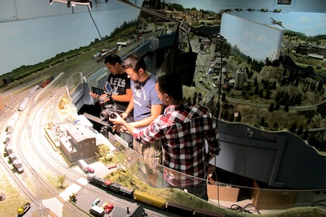


Our creative minds here at Element X Creative (Dallas, TX) were pretty stoked about the Association of Independent Commercial Producers (AICP) asking us to create this year’s Sponsor Reel for the Southwest show. The creative carte blanche was daunting given such a small window of time to concept and produce a 5-minute piece. Adding to the challenge were our own high expectations, not only in terms of storytelling, but also wanting to create something that had not been done in the history of the show.

During the conceptualization phase, one of our big breakthroughs was our lack of time in general. Short deadlines are notorious in this industry and we’ve all yearned to stop time for a second and catch our breath. This idea, fused with the childhood nostalgia of miniatures and train sets, became the base foundation for our story.


Beyond the short-notice four-week production window and already ongoing gigs in house, we tackled many other production hurdles. We decided to shoot the background plates on a Canon 60D for several reasons: (A) these DSLRs are just pumping out fantastic pictures, and the readily available lens selections make getting the right angle easy; (B) we wanted to shoot over-cranked at 60 fps to help sell the scale of the miniatures as larger than they were — also some of the cars/trains that we moved practically through the scene, would look more realistic slowed down a bit; and (C) the flip-out screen made it super easy to get into tighter spaces, and to see what was going on quickly.
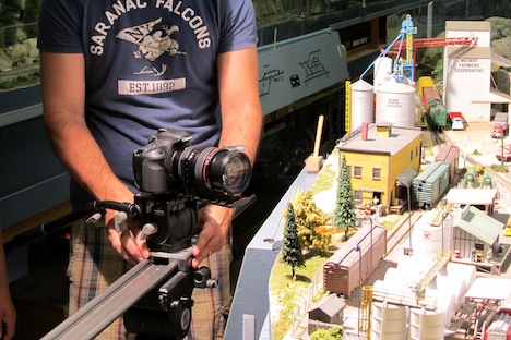


We also chose to shoot at a minimum of f/11, and when possible f/16 — I wanted to keep the DOF deeper, so it would seem more like it was photographed in the real world. We still wanted selective focus, but just not as much as you usually see when people show you photos of a miniature layout. This required us to dump a lot of light on the set to be able to shoot that stopped-down and still maintain a low ISO.

Last, we tried to get the camera as close as we could to ground level to mimic a large set — again with miniatures photographed that you might see, frequently it is shot from high above, since that is our natural vantage point in relation to them.


Using our internally developed OTTO rigging system, we put it through its paces quickly setting up dozens of characters and vehicles. Shooting such small miniatures with extreme focal lengths also made the 3D camera tracks challenging in certain shots. Logos were also pouring in at the last minute, so compositing was being handled up until the final hour.

Many late nights and take-out orders later, combined with a custom score and sound effects mix from Tequila Mockingbird, we came away with a unique animation that we are very proud of.

So take a peek at our latest and greatest! We hope you have as much fun watching it as our hero had while running around in the tiny world we created for him.

Official Press Release

CREDITS

Director — Brad Herbert

Executive Producers — Chad Briggs, Rick Perez

Producer — Amy Cass

Director of Photography — Brad Herbert

Location Crew — Luis Martinez, Jiss Kuruvilla

Location Manager — Robert Bray

CG Director — Eric J. Turman

Animation Director — Luis Martinez

Animators — Aaron Werntz, Steve “Q” Quentin, Andrea Thomas

Lead Modeler — Christopher McCabe

Modelers — Bobby Reynolds, Mathew Nith

Lead Rigger — Christopher McCabe

Rigger – Eric Turman

Editor — Luis Martinez, Brad Herbert

Lead Lighting Artist — Christopher McCabe

Lighting Artists — Dennis Kang, Mike Martin, Chad Briggs, Jason Moxon

Surfacing Artist — Christopher McCabe, Bobby Reynolds

Lead Compositor — Brad Herbert

Compositors — Dennis Kang, Mark Lopez ,Mike Martin, Laura Wallace, Christopher McCabe, Chad Briggs

Visual Effects — Dennis Kang, Mike Martin, Laura Wallace

Render Wrangler — Candace Morrish

Pipeline/Tools Programming — Steven Keiswetter

IT Director — Greg Glaser

Audio provided by Tequila Mockingbird

Executive Producer — Angie Johnson

Composer — Justin Tapp

Sound Design — Shayna Brown

Mix — Marty Lester

Background Plates : LMRA Railroad Activity

Special Thanks : Robert Bray (LMRA)

TOOLS

3D Package — Soft Image 2012 (.5)

Rigging — otto|rig — Proprietary Rigging Plug-in

Sculpting — Z Brush 4.2

Rendering — Arnold 1.13

Tracking — Syntheyes

Compositing — After Effects CS 5.5

Custom Scripts — Python

Cannon Cameras — 5D and 60D

360-Degree Wall, 4000 LEDs, Made with Cardboard, Paper, and Needles, in Action

360-Degree Wall, 4000 LEDs, Made with Cardboard, Paper, and Needles, in Action:re-blog from Create Digital Motion


Big pixels, enormous screen: watching the latest LED wall spring to life from basic materials, with a lot of effort, is a sheer delight.

Reader Konstantin Leonenko sends in this work, by technical producers YBCOZ, for the Dutch artist Giny Vos’ cinematic installation.

The sheer quantity of LEDs aside, it’s the ability of that cinematic quality to shine through in Vos’ work that ultimately makes the technical achievement more valuable.

The construction, which took a full month of work, is here collapsed into four minutes. During those minutes, what you’re seeing is some 360 degrees, 4,000 LEDs for 4,000 individual pixels, 8,000 needles, and a screen constructed from “cardboard and calque paper,” says Konstantin.

“Round’n'Round” cinematic led installation by Giny Vos.

location: Virtueel Museum ZuidAs.

technical production by YBCOZ

Amsterdam, July-October 2011.

Music: “How Long Is The Wrong Way” by Flanger

More of Vos’ work below (and elsewhere on Vimeo), or visit her site:

ginyvos.nl