Pages

Tuesday, March 22, 2011

Lexus 3D Projection

Lexus 3D Projection:re-blog from Computerlove

20110322_095948_lexus.jpg
20110322_095955_lexus2.jpg
20110322_100002_lexus3.jpg
3.jpg


8 minutes of show created for the launch of the Lexus CT 200h in France.

The Panini Projection

Art + Computational Aesthetics Call, and a Delicious Panoramic Projection Nerd-Out: re-blog from Create digital motion


As the level of knowledge and expertise in visual expression and science continues to explode, so, too, do gatherings on these topics grow in importance. Allen Bevans writes to bring readers’ attention to a call for works for a seriously sophisticated conference in Vancouver:

I’m a long-time reader of both CDMs, and I also happen to be co-chairing the Art track of the Computational Aesthetics 2011 conference, which takes places August 5-7 in Vancouver this year (just before SIGGRAPH). The conference goal is to build bridges between the Arts and Technology communities, with a special focus on visual art and related computational tools. Specifically, we are soliciting artworks and papers that emphasize the role of software creation as an aesthetic cultural activity. The call for participation is here:

http://www.cl.cam.ac.uk/conference/cae-sbim-npar-2011/CAe/CallForArtworks

The theme is broad – “the role of software creation as an aesthetic cultural activity” – and the larger categories are relevant to Motion readers and the work many of you are doing:

artworks that employ real-time visual processing;

artworks that employ computer graphics on the web;

2D or 3D artworks that run on stand-alone consoles;

virtual worlds created for the web;

Artist presentations, posters or screenings that explore topics related to computer graphics, modeling, and/or real-time visuals; and

Prints, pictures or artifacts produced through custom-built software-tools.

That’s a profound question, what cultural and aesthetic impact software making has. If you’re wondering what kinds of topics have been covered in past, you can find backlogs at:

http://www.computational-aesthetics.org/

Last year’s program leads down a topic that spans photography, lenses, the science of perspective, and the history of art. If you’re ready to jump down the rabbit hole – or fly off toward the vanishing point – there’s a fantastic set of resources along with the paper last year on the topic of the Pannini Projection. (Mmmmm… pannini.)

http://vedutismo.net/Pannini/

The video at top explains how the clever use of projection – and lessons from the techniques of painting – could facilitate “ultra wide video.”

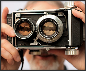
ALS1-demo presents a 30 second HD video clip, taken with a Canon EOS 7D, in 3 different projections. First, as shot with a 10mm fish-eye lens, horizontal field of view about 125 degrees. Next, reformatted to Panini projection with Panini-Video, same field of view. Third, reformatted to rectilinear projection, cropped to about 110 degrees wide. Finally, the Panini clip again.

The Panini version is the most natural looking of the three. In the fish-eye view, the curvature of straight lines is obvious, and things at the edges of the image seem to ‘writhe’ as the camera moves. The rectilinear view shows nice straight lines, but the edges are noticeably stretched and seem to ‘stream’ with camera motion. This would be even more obvious in the full width image (which would not fill the frame vertically). The Panini view keeps verticals straight, and is relatively free of both ‘writhing’ and ‘streaming’ effects. It looks more like an ordinary moderate wide angle view, than the hyper-wide-angle view it actually is.

See also an image of software, below, from the same article.

Now, this sort of heavy math may not be the cup of tea of everyone here on this site – at least not in terms of what you might present – but I can imagine the conference could have lots to offer presenters and audience members alike, and getting the call here on CDM might even expand the breadth of their programming. Have at it!

And, in the meantime, now I want to explore the possibilities of perspective.

Monday, March 21, 2011

SebastiAn – Embody

SebastiAn – Embody:


It’s happening. SebastiAn is finally coming out with his next album called Total later this year and he’s just released the music video for his first single Embody. As always the video is directed by Ed Banger artist extraordinaire So-Me who does an outstanding job with it. I knew he’d be doing good things this year after I heard his Uffie 2006 Parties Remix last year. 2007 is officially back in full swing people! New Justice, SebastiAn, MSTRKRFT.. I haven’t been this happy about electronic music in a long time and things can only get better from here. Everything changed in 2007, and now everything is about to change again.

Thursday, March 17, 2011

Wednesday, March 16, 2011

A Brief History of Title Design

A Brief History of Title Design:

133253826_1280.jpg


Don DeLillo covers by Noma Bar

Don DeLillo covers by Noma Bar: re-blog from CR Blog


Headphones? Gravestone? Musical note, or open door? Noma Bar brings his clever double take imagery to the latest editions of Don DeLillo's work from Picador...

The new covers were art directed by It's Nice That who approached Bar, represented by Dutch Uncle, to work with them on the project.

'It seemed obvious that the subtlety and craft in Noma's work was the perfect vehicle to try and communicate DeLillo's intricate and often sinister subjects,' they write on the Picador blog. 'We had interviewed Noma for a previous issue of our publication and were waiting for the right project to work with him on, and the DeLillo re-issues could not have fit more perfectly.'

'My challenge was to create a range of ten books by Don DeLillo, a summary of more than 30 years of his writing,' Noma Bar explains. 'After a long process that involved reading, researching and sketching, I started to pull out some of the main elements of each story and tried to understand how Don DeLillo tailored them together. The result is a bold image for each cover that looks conventional at first, but at second glimpse reveals the whole story.'


The new editions are out now. See picador.com.

Yelle-Safari Disco Club MV

Yelle:


Saturday, March 12, 2011

One Minute Puberty

One Minute Puberty:
133226903_640.jpg


Organise your desktop with Ikea

Organise your desktop with Ikea:re-blog from CR Blog


Hungarian ad agency Laboratory Ideas have come up with a nifty desktop app that allows you to organise your computer as if it were a set of Ikea shelves

We could make a very weak joke about flatpacks and allen keys here but suffice to say that Laboratory promise that their digital shelving unit is very straightforward to set up.


'Just like Ikea's furniture, the Ikea e-Folder set has to be assembled by you: it consists of a background picture with an Expedit storage unit and an icon set made of Ikea's very own organisers,' the agency say. 'Once you set it up, you can put order to the chaos on your desktop.'


For those wondering exactly how it works, or who would like to have a go, here are the English setup instructions for the Mac version:

1. Select the volume, application, folder, or file whose icon you want to stamp onto another, just click the icon to select it.

2. From the File menu, choose Get Info or press Command-I to open the Info window.

3. Click the icon in the upper-left corner of the Info window to select it.

4. From the Edit menu, choose Copy or press Command-C.

5. Select the volume, application, folder, or file whose icon you want to replace.

6. From the File menu, choose Get Info or press Command-I.

7. Click the icon in the upper-left corner.

8. From the Edit menu, choose Paste or press Command-V to replace the icon.

The e-Folder set can be downloaded from the Ikea sites in Hungary, Slovakia and the Czech Republic.

Credits
Advertising agency: Laboratory Ideas / Laboratory Digital, Budapest
Creative director: Sándor Haszon, Alex Szénássy
Copywriter: Judit Kun
Art director: Diána Pusztai, Sándor Haszon
Illustrator: Péter Muka
Developer: Gergely Muka

Wednesday, March 9, 2011

Mauro Carraro, Raphael Calamote, & Jeremy Pasquet: Matatoro

Mauro Carraro, Raphael Calamote, & Jeremy Pasquet: Matatoro:re-blog from Motionographer


MATATORO from Matatoro Team on Vimeo.

Matatoro, directed by Mauro Carraro, Raphaël Calamote, and Jérémy Pasquet, is a lovely meditation on bullfighting that mixes a lush color palette with well-crafted non-photorealistic 3D rendering. It seems like the short films coming out of France’s animation schools (this one being from Supinfocom Arles) are constantly achieving new ways to tastefully combine traditional illustration styles with 3D. What sets this film apart for me is the unique storytelling point-of-view. Rather than a traditional narrative, the story is more of a stream of consciousness emotional arc (with clever shape-shifting arena crowds to boot!).

Check out concept art for the film here and a bit more on the process in this making-of film. We were lucky enough to catch the filmmakers for a Q&A, check it out after the jump!


Where did the idea of a bullfight come from?


Mauro: Personally, I was charmed and frightened after seeing my first bullfight four years ago in Arles (South France), the reach of the colors, rhythm, symbols, and volumes. The rapport between the matador, the bull and the public permeating continuously – it was all that I searched for in an animation film.

The balance between the watercolor textures and dimensionality is really stunning. There are many times where every frame looks like a key pose, but other times where the camera seamless revolves around a character. Was there any frame animation or was it all 3D? a mix?


Mauro: The approach of the textures on this project was totally different from what we had ever tried before. The goal here was to get as close to a “traditional” result as possible.


toro from Matatoro Team on Vimeo.


Raphael: After various tests with Photoshop, the result was too close to what we were used to seeing in 3D animation, so we decided to print the UV boards out and draw on it traditionally in pencil and paper. We then had to scan the textures obtained for use on 3D objects.


matador from Matatoro Team on Vimeo.


The difficulty of this work was to find the “flow” of pencil lines, a logic in the paths to give an idea of the volume of the characters. So that the textures wouldn’t seem “frozen”, as we are used to seeing, but would seem to “vibrate” as redrawn frame by frame. We made an animation loop of five textured images, at three different sizes (A5, A4, and A3), in order to change the texture depending on the value of the planes. The rest is compositing.


chèval from Matatoro Team on Vimeo.


Jeremy: We used 12fps to reinforce the traditional side of animation. In the animation, the keyframes were the most important. They were based on drawings or illustrations taken from pre-production. The movements are as simple as possible, to go to most of the action by focusing on picture composition.

How tightly did you work with the sound designer/composer?


We ask the composer to work on our film more than one year before the final cut! That’s very unusual, but very comfortable for the team. In fact, we met together really late, because of the distance between Paris and Arles.

I sent Pierre Manchot more than ten versions of the storyboard. He made five themes with the piano solo. I chose one and he orchestrated it with a real corrida brass band (fifteen musicians) called Chicuelo II from Arles.

A lot of times, we didn’t understand each other, because the vocabulary of animation and music is really specific… Conditions were really perfect financially, because we had the SIRAR grant for music (delivered by the Aubagne Music Festival and SACEM) that permitted us to have an entire orchestra, a studio, an engineer, and a composer!

During the recording and the mix the whole the team was present, allowing for real discussion between the directors, conductor, and sound engineer.

A lot of the shot framings are very dramatic. How much of the composition was decided upon at the storyboard phase?


The start was three or four handmade drawings, without any connection.


We had just one rule, follow the chronological order of events/choreography in the bullfight. We symbolized the moody public with clapping hands, laughing mouths, judging eyes and angry forks, matching each type with a peculiar universes: an arena, a carousel, a circus, a temple.

We produced more and more drawings and eventually made a musical slideshow to find the structure. The film became an animated picture with cryptic symbols and floating environments.

There was a huge amount of work on the storyboard and image composition, everybody was involved in thinking and giving his ideas. Then we selected the most interesting and most dynamic and dramatic storyboard sequences. Keeping in mind the images made in pre-production for some shots are closer to a painting than a traditional film.

How long did production take?


Production for the film took a year and a half. Three months of pre-production (creation, research, design, writing, story board…) and a full year devoted to the production and post-production.

What are you up to next?


Mauro: I’m preparing a new short film that should be a Switzerland production, about my experience on the Way of St. James.

Raphael: I currently work at Cube Creative, where I’m working on textures, layout, and rendering/compositing. I am waiting to find a little time to make a one-minute short film.

Thanks to Team Matatoro for their time! And a special thanks to Yves Geleyn for helping out with translating the interview.

Credits

Directed by Mauro Carraro, Raphaël Calamote, Jérémy Pasquet

Original music composed by Pierre Manchot

Sound Design by Mathieu Maurice

Produced by Supinfocom Arles – 2010

Tuesday, March 8, 2011

More Visual, More Immersive: Percussion Lab Picks, Mapping as Means to an End

More Visual, More Immersive: Percussion Lab Picks, Mapping as Means to an End:re-blog from Create Digital Motion


"Portal": 3D Projection Mapped Sculpture from Integrated Visions Productions on Vimeo.


Live visuals for music continue to mature – not because of any new technology so much as because of improving technique, more refined sensibilities, and closer collaboration between music and visuals.


We’ve talked a lot about projection mapping. What’s encouraging is that the use of mapping, apart from being mere gimmick, is becoming a means to an end, a way of putting an aesthetic stamp on a performance and heightening the sense of immersion. Mapping is a way of manipulating the projection surface, as it should be, a way of amplifying the content.


It’s good enough that musicians are taking notice, too. So, with apologies to our friends the good folks of Percussion Lab, I’m going to blatantly plagiarize your blog post, because you’ve got exceptional stuff no one should miss.

On the Visual Tip


Brian Blessinger writes the post there and selects the videos I’ve added here. If you’re unfamiliar with Percussion Lab, their curated selection of mixes is a taste-making beacon for the musical world, as are their Monday night radiocasts (tune in tonight, NYC time, to Radio23. It’s a must-visit site:

http://percussionlab.com/


It’s worth visiting each of the works he mentions, as part of the trend toward greater immersion and tighter integration between sound, image, and space.


Top:


mind warping video projection mapping collaboration on a sculptural screen designed by artist Kris D with video mapping content designed by Integrated Visions Productions’ Bryan and Michelle Dodson.


Kris D: Screen Design and Fabrication

Bryan Dodson: Animation, Fabrication, and Editing

Michelle Dodson: Animation and Fabrication

Adam Barfield: Musical Score


krisd.net/​

integratedvisions.net/​


(Documentation on the process of this video follows below).


Making of "Portal": A 3D Projection Mapped Sculpture from Integrated Visions Productions on Vimeo.


Gabbatron 2011 from Dr K on Vimeo.


From rectangles to spiral horns, Gabbatron 2011 produced a different kind of projection surface, above:


Built for the Kazimier Records Launch this was used for the Dogshow set. the horn measures 2m wide x 4m long and is video mapped using Modul8.


And lastly, for a festival’s worth of material, L.E.V. from last year:


L.E.V. (Day2) from Juan Rayos on Vimeo.


Sábado 1 de Mayo del 2010. Gijón


Signal, Plaid, Shackleton, Scuba, Ben Frost, Aufgang, AntiVj+Murkof, Kangding Ray, Jorge Haro


El retrato de un festival y sus diferentes facetas. Sin palabras, solo imágenes y sonido para transmitir las sensaciones, la atmósfera… dos intensos días de un evento musical y visual.


Portrait of a festival and its various facets. No words, just pictures and sound to convey the feelings, the atmosphere … two days of musical and visual event.


Finally, here’s something not in the Percussion Lab post but I think appropriate to mention:


Chi Ka’s work, under the name Imagima (and Visualicious) is strikingly sculptural. She works with 3d-printed pyramids and rich, abstract visuals, and has used the open source environment Pure Data (Pd), as well as researching this kind of technique as part of her studies at NYU’s ITP program.


Man on a Guinness World Record mission hand-draws his black marker collection to date

re-blog from Cool Hunting


bibs1.jpg

Inspired by a Guinness Book of World Records entry for the largest collection of cigarette rolling papers, Toronto-based artist Allister Lee of Studio B.I.B decided it was time to set a goal for himself and started collecting black markers. To 'mark' the 500th acquisition in this graffiti-culture obsession, and midpoint to his overall goal (and hopefully Guinness record!), he's released a hand-drawn print that shows the complete historical and international spectrum of the 500 pens in his collection to date.


bibs3.jpg

The Studio B.I.B 500 poster, printed on 80-lb. gloss poster and an unlimited edition, measures 32' x 42'.


bibs2.jpg

It sells for $40 in NYC at the Reed Space, in San Francisco through Equal Distribution and online at Studio B.I.B.

How Are You Doing?

How Are You Doing?:re-blog from Motionographer


New fun from Michel Gondry for Living Sisters!

Movie Barcodes

Movie Barcodes: re-blog from The Motionographer


Interesting tumblr which shows every frame of a movie compressed into a single image – prints are also available.

Monday, March 7, 2011

The 50 Greatest Opening Title Sequences of All Time

The 50 Greatest Opening Title Sequences of All Time:


IFC Presents: The 50 Greatest Opening Title Sequences of All Time (with vids) via idsgn.org

"KICK START" Monday Music Tube (re-blog from SuperrZaaap!!

re-blog from SuperrZaaap!!


สวัสดีมิตรรักแฟนเพลงทุกท่าน
ต่อไปนี้ ทุกๆวันจันทร์ (วันที่ทุกคนแสนนนจะขี้เกียจไปทำงาน)
เราจะมีเพลงเพราะๆ หลากหลายแนว มาให้ คุณๆได้ฟังกัน ใน
'Kick Start' Monday Music Tube!!
โดยจะมีการเปลี่ยนหมุนเวียนแขกรับเชิญทุกอาทิตย์ เพื่อมาแชร์เพลงกัน และ
เพื่อเป็นการเริ่มต้นสัปดาห์ที่สดใส อย่างมีพลัง ว่ะ หะ หะ
เริ่มเลยดีกว่า


The Vaccines - If You Wanna


Sleepy Rebels - 'Magic Girl'


Zoot Woman - Just A Friend Of Mine


OMD - History of Modern


The Limousines – Very Busy People


Bag Raiders - 'Sunlight'

Thursday, March 3, 2011

The Blind Photographer

The Blind Photographer:re-blog from the Awesomer

The Blind Photographer


Pete Eckert was the winner of Artists Wanted: Exposure 2008, an international photography competition. He’s also totally blind. This video is a tiny peek into his world and his creative process.


| Artists Wanted | In Focus : Pete Eckert from Artists Wanted on Vimeo.