Pages

Wednesday, December 28, 2011

Moving Brands leans HP 13 degrees forward

Moving Brands leans HP 13 degrees forward:-reblog from CRBlog


Moving Brands has proposed a sharp new mark for Hewlett Packard that aims to re-establish HP as a brand at the forefront of technological innovation


As our sister title Design Week revealed yesterday, Moving Brands' new mark is the upshot of a process that began in 2008 when the consultancy was charged with the development of brand strategy and experience design at HP.


1954 logo


Hewlett Packard was perhaps the original Silicon Valley success story. It was founded in a garage by Stanford engineering graduates Bill Hewlett and Dave Packard in 1939 and proved an inspiration to the young Steve Jobs who had a summer job there. Jobs' partner Steve Wozniak also worked at HP and designed what became the first Apple computer there - he was obliged to offer it to his employer first but HP turned the opportunity down.


What Moving Brands found at HP is a familiar corporate story - a company once renowned for innovation that, thanks to successive acquisitions, had become bloated and somewhat lacking in personality and direction. From being one of the most innovative firms in history, it had become known as just another boring supplier of printers and PCs. "The once iconic brand was deemed dull and lifeless by consumers and business customers alike," as Moving Brands says in its case study here (which details just what a complex brand strategy project this was).


With its recent advertising from Goodby Silverstein, (including the Hands campaign starring various 'cool' celebs, above) HP had been trying to make up some of that lost ground.


For the visual identity segment of its work in helping transform perceptions of the brand, Moving Brands' proposed solution is a stripped down mark that abstracts the HP name into four bars that, as the studio claims "lean into the future" at a 13 degree angle - the same angle used in previous HP logos. It's a determinedly modern mark that harks back to the likes of Muriel Cooper's MIT Press logo (below). This idea of the 13 degree angle has also been applied across other aspects of the design system created for HP including photography and other graphic elements.


The mark is incredibly simple, but in these days of Photoshop gradients and 3D gimmickry beloved of so many identity designers, all the better for it. One quibble - is it obviously 'hp' or could it read 'bp' to the uninitiated? Presumably once it has been repeated a gazillion times on ads and websites and everywhere else (as in these mock-ups, below) we will come to associate it unquestionably with the brand.


The temptation with so many of these projects is to go for a mark that attempts to do too much, cover too much ground, present the many faces of a multi-faceted organisation - as in the current vogue for flexible systems. But HP's problem was that it had too much going on. It needed a single, strong voice behind which its 300,000-odd employees could unite. And Moving Brands has provided it elegantly.


But, and it's a big but, the new identity has yet to be implemented. As Design Week revealed, the roll out is in the hands of HP, what they choose to do with it, and which parts of the proposed visual identity programme they choose to adopt, is up to them. It's very unusual for a consultancy to go public with aspects of a corporate identity that have not, as yet, been officially implemented. A little bit of testing the water perhaps?


HP has already started to use some of the additional visual elements developed by Moving Brands (photography, typeface etc) alongside its existing logo in a kind of halfway-house (see above film the film has subsequently been blocked). Will it now go the whole hog and adopt the new mark too?


UPDATE: Design Week reports that "there are no plans to implement the new logo. A spokesman for HP says, ‘The design system created with Moving Brands was the only aspect of this work that was approved. The logo was a working draft that did not get adopted by HP'."


UPDATE TO THE UPDATE: Moving Brands has now removed the proposed new logo from its website which now carries this statement: "We have removed the HP case study per the request of HP, in order to clarify the distinction between the aspects of the work that were setting a creative vision for the brand but were not implemented in the market, and the aspects which reflect the actual in-market applications of the Identity and Design System. The ‘Progress mark’ logo is not the go-forward direction for HP."

Cultural figures

Cultural figures:


British designer Jon Daniel's collection of African American action figures includes Malcolm X, Muhammad Ali and a coveted 1975 Super Agent Slade toy. Here, he explains what led him to look to the US for cultural inspiration and to start collecting...

Daniel recently contributed to CR's October Monograph, Stamps from the African Diaspora, which included a series of stamps featuring prominent black cultural figures and also formed the basis for an exhibition at the Stanley Gibbons shop in London.

Growing up through the late 1960s and early 1970s, writes Daniel, I think I am fairly typical of the British-born, first generation offspring of West Indian parents, in my search for identity.


It took me a long time to come to terms with Britain being a part of who I am. There was little in the British culture that either appealed to me or I felt I could be a part of. Any positive images or messages, were all coming from the West Indian culture of my family and the African American culture of the United States.


I was fortunate as a child to visit America on a few occasions to visit other members of my family living there. Everything about America seemed brighter, bolder, blacker and better.


The sheer volume of the sophisticated tv programming available such as The Jeffersons; cartoon series like The Jackson 5 and The Harlem Globetrotters; motion pictures like Shaft, Car Wash and The Wiz; and the music, funk, soul and R'n'B that we could also access in the UK through import records or pirate radio, all had a profound influence on me.

If I could have grown up in Harlem at that time, I could not have been happier.


And no doubt, this is a desire that has been instrumental in the nature of the collection of action figures I have subsequently acquired. Contrary to the nature of the subject matter, I did not start collecting them until I was in my late twenties / early thirties. Possibly, the birth of my children was a major factor.


But more likely, it is due to the rise of the internet, as the availability to scour the globe and find these items more easily became a reality.


My main focus is collecting figures from the 1970s and 80s, as they are naturally the rarest and embody the period of time I most identify with. One such figure that I am most proud of (and only recently acquired after a search for several years and many unsuccessful eBay bids) is the 1975 Shindana Super Agent Slade action figure.


A truly ‘superfly' figure, modelled on Richard Roundtree's black private detective character, Shaft, it is highly sought after by collectors of this genre.


So what's next? One day I hope to finally acquire a Medicom Jean-Michel Basquiat RAH action figure. It's not extremely rare, but it is extremely cool.

And at the end of the day that's what it's all about.

Jon Daniel is a designer and art director and leads the creative team at branding and design studio, ebb&flow. See jon-daniel.com.


Mr. T and the Lando Calrissian character from Return of the Jedi

Thursday, December 22, 2011

Magnetotron is an armonica mellotron mashup

Magnetotron is an armonica mellotron mashup:re-blog from Hack A Day


[Michael] is a huge fan of old media formats. There’s something special about quarter-inch thick 78s, fragile blue cylinders holding music, and thin strips of mylar that preserve the human voice. He’s had an idea for a tape-based instrument for a while, and now that the Magnetotron is complete, we’re in awe of this glass harmonica and Mellotron mashup.

The Magnetotron is a large rotating cylinder that has dozens of strips of audio tape attached to it. The cylinder rotates with the help of a small motor. As the strips of tape rotate in front of him, [Michael] presses two tape heads up to the instrument, making some sort of sound.

Each strip of tape contains a recording of one note, like the venerable Mellotron. Instead of physical keys, the Magnetotron is played in a much more tactile fashion like the glass harmonica. The output of the Magnetotron is interesting with a whole bunch of wow and flutter. Check out the demo of [Michael] playing his instrument at NIME in Brooklyn after the break.


Playing with routers, vinyl and music concrete

Playing with routers, vinyl and music concrete:re-blog from Hack A Day


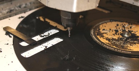
When Danish musicians Vinyl Terror and Horror visited [Daniel] and his CNC router at EMS in Sweden, things were sure to get interesting. The band uses heavily modified record players and modified vinyl records to produce strange soundscapes. During their time at EMS, Vinyl Terror and Horror were able to produce some strange vinyl that shouldn’t play on a record, but do.

Most of VTaH and [Daniel]‘s work is centered on a CNC router. This soundscape took two records to produce. The spare rectangles were cut from a second record and designed to be press-fit into the host. When the newly assembled record is played, truly bizarre ‘skipping-but-still-playing’ sounds are made. The same process was used on the puzzle piece record the guys made.

The experiments continued by cutting a circle out of a record and gluing it back into place with a different orientation. This idea was taken to its logical conclusion that serves as the exemplar of music concrete.

[Daniel] and Vinyl Terror and Horror came up with a pretty neat spin (HA!) on century-old way of making electronic music, so we’ll give all of them some props. Check out all the videos from VTaH’s time at EMS after the break.


rectangle pieces from vinyl terror & horror on Vimeo.


Friday, December 16, 2011

Small (Mad) Worlds (Surreal!)

Small (Mad) Worlds:re-blog from Polkadot


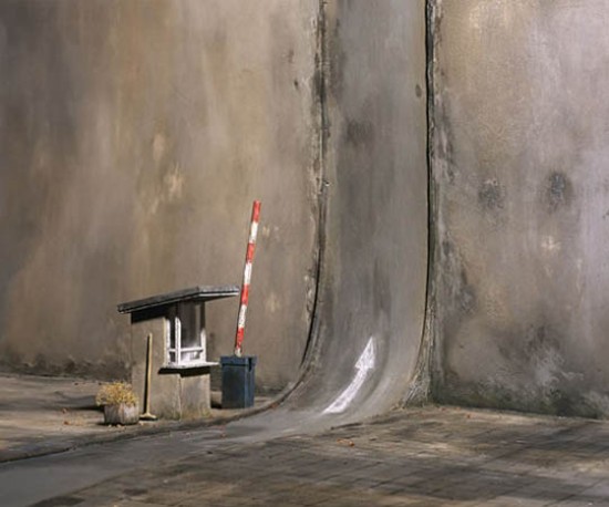
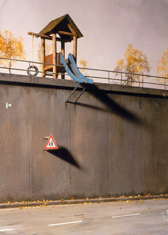
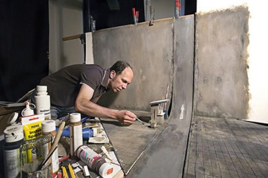
Dystopian universes, middle-class nightmares and surreal architecture: German photographer Frank Kunert portrays a satire of contemporary society through his intricate, flawlessly detailed miniature models. He actually creates 3D model subjects out of deco boards, plasticine and paint and then he photographs them, with his impeccable attention to detail.

Frank Kunert’s photographs were part of NYC exhibit at the Museum of Art and Design, named “Otherworldly: Optical Delusions and Small Realities” (June 7 – September 18, 2011).


LITTLE PRINTER (so cute, I want it)

LITTLE PRINTER:re-blog from Polkadot

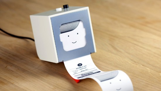
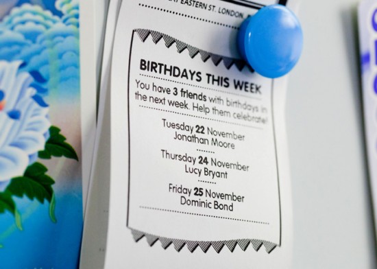
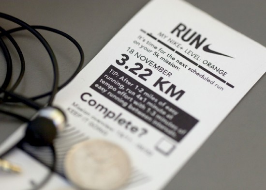
Riuscirete a farne a meno? Un pò stock ticker anni’30, un pò fax anni’90, Little Printer potrebbe diventare il vostro compagno sempre connesso al web, ma che stampa per voi gli updates che vi interessano, gli impegni del giorno, il sudoku per distrarvi, i messaggi dei vostri amici. Senza bisogno di un pc, lo configurate con il vostro telefono, e vi portate dietro la piccola stampa come promemoria. Gli utilizzi e le possibilità sono parecchie, i produttori stanno creando le prime partnership con i grossi nomi del web e non solo ( Google, Foursquare, Nike…). Non ci resta che aspettare il 2012…


Caratteri

Caratteri:

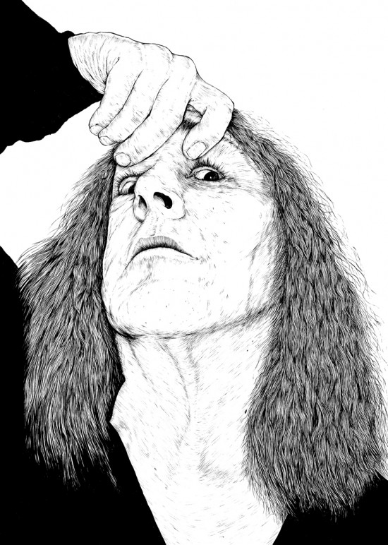
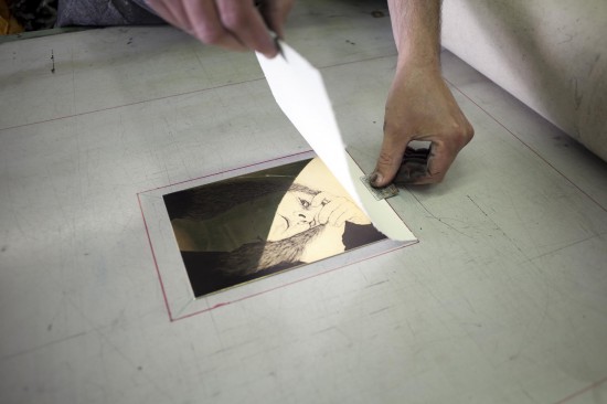
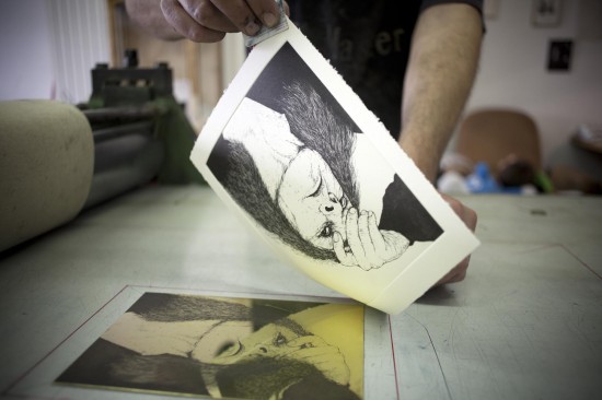
Caratteri è una collana di libri d’artista, curata da Alessandro Mininno e Gabriele Miccichè per lo studio editoriale ready-made, che vuole unire artisti di formazione diversa pronti a confrontarsi, così come associare tecniche tradizionali dei libri d’artista alle moderne soluzioni digitali.

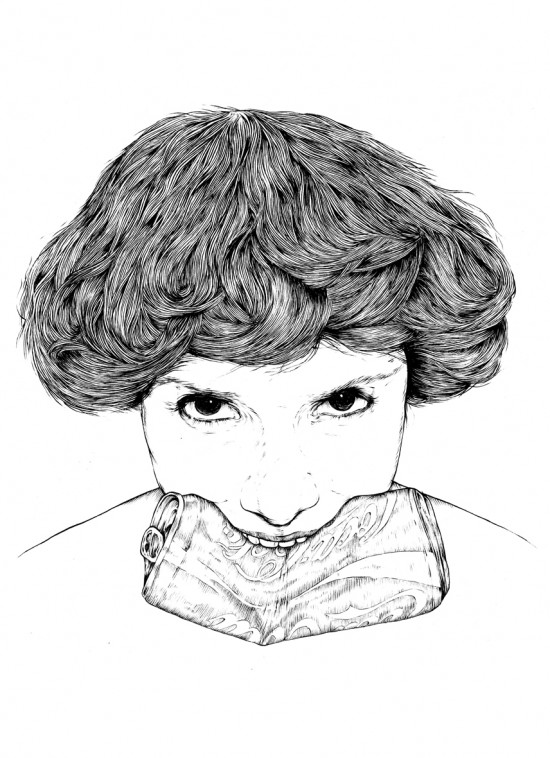
Il primo volume della collana, dal titolo Sette giorni, vede il dialogo tra il musicista e poeta Manuel Agnelli (leader degli Afterhours) e l’artista Marco Klefisch che ha realizzato appositamente 8 incisioni originali. Venerdì 16 dicembre il libro, realizzato in sole 100 copie, verrà presentato presso il Salone d’onore della Triennale di Milano, insieme ad un’ installazione di Marco Klefisch, ispirata alle immagini realizzate per il volume a cui si accompagnerà un concerto di suoni e parole eseguito da Manuel Agnelli, Rodrigo D’Erasmo e Xabier Iriondo (voce, violino e chitarra degli Afterhours).