Pages

Sunday, January 16, 2011

Autechre-Inspired Geometrical Audiovisuals; Grab the Cinema4D File Free

Autechre-Inspired Geometrical Audiovisuals; Grab the Cinema4D File Free:re-blog from CreatedigitalMotion


fret_1 by Equiloud and Leisure-B from EQUILOUD. on Vimeo.

I really enjoy when I get the chance to cross-post stories on Create Digital Music and Motion; I think it means maybe we’re doing something right.

Inspired by Autechre, the collaboration of Leisure-B and Usselino produced this pulsing music video full of primitive geometries. It’s not entirely unlike some works we’ve seen before, but at the same time, there’s enough here to spark imaginations about how visual geometries and music might be connected (a topic foremost on my mind these days). I also like that you can download the Massive synth presets and Cinema4D file used to create it. It’s also interesting to watch Ableton Live, designed by and for musicians, in the hands of people doing video production. In all frankness, I think visual software has often lacked the invention of music software in thinking about time, rhythm, and user interface, even if music software often tends toward large arrays of clunky virtual knobs. I hope this decade brings more creative thinking. (Alternative approaches to the timeline on tablets, perhaps?)

The creators comment a bit on the visual process:

fret_1 was made with Cinema 4d 11.5 and its Mograph, Deformer Objects (like Explosion FX) and Particle Emitters. Also, After Effects CS4 was used for all the compositing work and some 2.5D-Animations. Inside After Effects, different Plug-Ins like Twitch and Optical Flares from videocopilot.net were also applied. Of course a whole bunch of standard Plug-Ins like Levels,Time-Remapping, Glow, Blur etc, were involved.

Usselino originally created the video based on the Autechre track “Vose In”. After showing the video to Leisure, both gentleman figured that a change of tune might not be a bad idea.

Usselino:

“I personally very much appreciate geometric primitives. They have a certain perfection to them and appear very statical. So why not play around with them and make them more vivid somehow, and with that more interesting for a broader audience? How can I do it, and make other people enjoy it as well?

The project evolved over a beer, which I find can also be an essential ingredient to artistic workflow.

Humanworkshop on the project

Download the Cinema4D file

On the music side, on Create Digital Music

Tuesday, January 11, 2011

DDJ-S1 and DDJ-T1: the full scoop

DDJ-S1 and DDJ-T1: the full scoop:re-blog from DJTechtools


Jumping on the momentum that yesterday’s leak produced, the full details and official announcements have come from the Pioneer, Serato Audio, and Traktor camps. Our complete lack of factual information has been remedied: the Pioneer DDJ-T1 will arrive in February 2011 with a price tag of $1299/£899, while the DDJ-S1 will be released in March for a heavier $1599 / £1099. We’ve got all of the solid facts and specifications, along with better pictures of these new controllers – keep reading.


DDJ-S1 ($1599/£1099)


DDJ-S1

Those of you who had keen eyes on our the leaked image of the DDJ-S1 in our previous post noticed that there was a Serato ITCH logo printed on it- and we’re sad to say that all indications point to the fact that the S1 isn’t going to act as a SSL box, leaving dedicated Scratch Live users in the dust again when it comes to providing a one-stop piece of kit. The S1 is clearly designed for a two deck mixing style, and while it does have a Mic and Mic2/Aux input, they’re not treated like independent channels whatsoever.

Despite the lack of four decks, there are a number of nice features on the unit, including buttons for instant doubling of tracks from one deck to the other, a needle strip search with a red LED progress bar (“Playing Address feature”) above it, a alphabetical search function using the same needle strip control, and a beat grid adjust that is mapped as a shift-function for the jog wheels.

Additional facts from the Pioneer DDJ-S1 product sheet:

1. Familiar Pioneer control surface offers DJs instantly recognizable and responsive controls

The controller has excellent operability thanks to the similarity in layout to other professional Pioneer DJ equipment. The master and channel level meters are placed together centrally on the unit, helping DJs to monitor the level of the master and each channel while adjusting the volume. The controller also has an effect control area, so you can add Serato ITCH’s DJ FX to your mix.

2. Laptop dock

The dock allows you to position the laptop under the controller, for optimized performance space and visual reference.

3. Includes a Playing Address feature that allows DJs to visually confirm the position of a song

Track song progression on a unique LED display, so you know exactly where you are while DJing. The controller also includes a “Needle Drop” search function, allowing you to quickly skip through a song to a preferred playback point.

4. Plug and play connection

You can connect the controller and computer with just a USB cable*1, so you can truly “plug and play”. Since all of the buttons and knobs have already been assigned DJ software functions, it’s easy to start DJing without any complicated settings.

5. Designed specifically for Serato ITCH software with advanced Pioneer features

The controller offers tight integration with Serato ITCH software. Added controls include an alphabetic search function for quick song selection from large music collections and a slip mode for looping, reversing, and scratching without changing the song tempo.

6. Multiple input and output options

The controller is equipped with various inputs and outputs, including balanced XLR input/output (1 each) for connecting professional PA equipment.*2

7. High quality design for a clear and powerful DJ sound

Pioneer has utilized technologies developed from its professional DJ equipment, including Pioneer mixer audio circuitry, to ensure high quality sound. This, coupled with audio characteristics optimized for Serato ITCH software, complete the superior sound design of the DDJ-S1.

8. Other features

• Each channel fader and cross fader employ a lock mechanism to prevent the knob from slipping

• Built-in audio interface

• Both microphone inputs are equipped with a talk-over function to lower the music volume when receiving voice input from the microphone.

*1 Some functions are limited. Furthermore, depending on the power supply of the USB port of the computer, the controller of may not operate on bus power. If this occurs, connect the included AC adapter.

*2 Devices to amplify sounds such as microphone, amplifier, or speaker.

DDJ-T1 ($1299/£899)


DDJ-T1

In a clear move to put it in the same league as the S4, Pioneer’s four-channel T1 controller for Traktor will be paired with its own version of Traktor- with control over all four decks. In addition, the layout of the controller does a good job of following the layout of Traktor- the FX units look nearly identical their digital counterparts in the software.

Unlike the S1, the DDJ-T1 feels lacking in visual feedback. There are no VU meters for each individual track, and no handy needle search LED to let DJs know where we are in the song. Not a serious setback, especially considering that your laptop is right behind the controller (it slides right under!) but still features that we’d expect in both models.

DDJ-T1 with laptop dock

Facts from the official Pioneer DDJ-T1 product sheet:


  • Plug-and-Play USB Connectivity – All buttons and knobs have been pre-assigned, so users can quickly connect the controller to their laptops by USB cable and start their performances without having to adjust any complicated settings. Additionally, the DDJ-T1 can be powered through the laptop’s USB port.*1
  • Included TRAKTOR DJ Software – Includes Pioneer DDJ-T1 Edition TRAKTOR DJ software. This popular software is loaded with original functionality, including four-channel deck control and a channel fader start function, which makes it easier for DJs to create exact cue starts.*2
  • Specially Designed User Interface – The controller layout and TRAKTOR software interface are identical, ensuring ease-of-use and precise control. The DDJ-T1 is modeled after the proven design of the professional Pioneer DJ player and mixer and integrates 115mm jog dials, accurate search functionality to quickly find playback points, a load button for song data and a master synch button for beat matching across four channels.
  • Highest-Quality Sound – The controller is optimized for the TRAKTOR DJ software and incorporates technology from Pioneer’s professional line of DJ equipment to ensure the highest quality sound output that DJs have come to expect from Pioneer products.

Additional Features include:

  • Proprietary lock mechanism called the P-LOCK Fader Cap designed to prevent fader caps from slipping.*3
  • Premiere built-in sound card.


*1 Some functions are limited. Furthermore, depending on the power supply of the USB port of the computer, the controller of may not operate on bus power. If this occurs, connection of the included AC adapter. is required.

*2 A function to start playback from a user-specified point.

*3 Patent pending.

Keep an eye on DJTechTools as we adventure to NAMM this weekend- we’ll give you a much closer look at these units and other exciting products that have yet to be announced.

NI Teases us with New Software and Sound Cards

NI Teases us with New Software and Sound Cards:re-blog from DJTechtools


This brand new video is the latest installment in NI’s teaser campaign. It shows off some upcoming products, namely a new Traktor Software and some mysterious hardware but does not reveal what they actually are. Continue reading for some close ups.


NEW SOFTWARE- TRAKTOR PRO 2?


The S4 software has been out for months now but the features it contains have been on lock-down, available only to those purchasing the S4 controller. From the video you can see that those features will now be available in a new version of Traktor- most likely called Pro 2. It looks to contain:

  • colored waveforms
  • sample player
  • loop player
  • loop recorder
  • and probably more from the s4 software

Inside scoop: NI has told us that the X1’s used in the video are running a special mapping that allows control over the sample and loop decks in the new software. As far as release date, pricing and other information that you actaully want to know- mums the word!

NEW HARDWARE


There is again a precedent here. NI always discontinues products or puts them on sale a few months before a new announcement. Remember the audio 4/8 fire sale? Well, its looking like there will be some new dj audio hardware hitting shelves some time soon. Even though they wont be exhibiting this year, I would expect an announcement about the sound cards later this week at NAMM.

SPEAKING OF NAMM


A full team of will be heading to NAMM 2011 this week to bring you all the news. A first report will be published thursday and then we will follow that up with our full annual report on Monday.

Friday, January 7, 2011

Starbucks unveils new logo

Starbucks unveils new logo:re-blog from CR Blog


US coffee giant Starbucks has unveiled a new identity created by its in-house design team and studio Lippincott. It centres on the Siren logo and does away with the words 'Starbucks' and 'coffee' altogether...

The 'Siren' figure has been part of the Starbucks identity since the company launched in 1971 and this latest redesign ties in with their 40th anniversary. The new logo essentially takes the Siren out of her ringed frame (see previous iterations of the identity, below), changes the background colour to Starbucks green and removes all text – perhaps a nod to the fact that the company now sells a range of other products in addition to coffee. The identity will be rolled out across all branches in March.

'From the start, we wanted to recognise and honour the important equities of the iconic Starbucks logo,' writes 'Mike P', the company's senior creative manager.

'So we broke down the four main parts of the mark – colour, shape, typeface and the Siren. After hundreds of explorations, we found the answer in simplicity. Removing the words from the mark, bringing in the green, and taking the Siren out of her ring. For forty years she's represented coffee, and now she is the star.'

The next step was to bring in a 'more sophisticated stroke width and spacing and a smoother line flow.' The Siren's hair and facial features were apparently also refined.

The question is, in light of last year's most infamous logo debacle could the new Starbucks ever 'do a Gap'? I very much doubt it. Despite the dissent already emerging on the company's website from largely negative commenters – not to mention the need to monitor their 1.1m followers on Twitter – one thing that stands out is that Starbucks has ensured the big reveal is shown in context; on a paper cup.

It sounds obvious, but when the Gap identity announced itself to the world online, it was the same old decontextualised jpg that people were posting, emailing and generally taking apart. Starbucks has already countered the 'you have to see it in the flesh' argument by simply showing it in the way most people will engage with it. And doesn't it seem all the better for that?


More details on Starbuck's new identity can be found on their website, here. And on twitter.com/starbucks.

Wednesday, January 5, 2011

LATIMER the world champion of magic


www.latimeronline.com

Daft Punk Helmet History chart


from thedaftclub.com

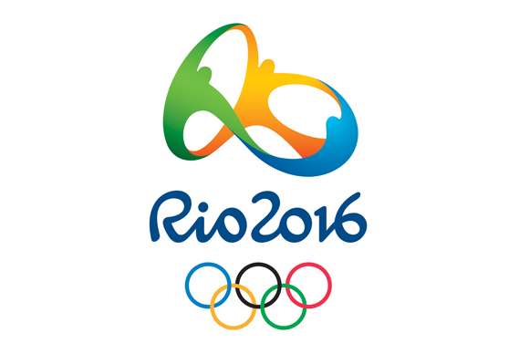
Rio 2016 Olympics logo: a closer look

Rio 2016 Olympics logo: a closer look:re-blog from CR Blog


Yesterday we posted a story on the furore surrounding the logo for the Rio 2016 Olympics, which was unveiled on New Year's Eve. Today we take a closer look at the work itself.

Before getting in to the logo, perhaps a bit of context would be useful. It's no use designers pining for another Otl Aicher, a master designer handed almost complete control over the visual identity of a major international sporting event: those days are gone. To create an identity for such an event today, particularly the Olympics or World Cup, is to enter into a process that is torturous, endlessly frustrating and enough to test the patience of a saint. It is a process, moreover, that flies in the face of accepted wisdom regarding what is neeeded to produce strong, distinctive, memorable design. There will be no single, clear, consistent decision-maker. There will be a multitude of competing interests to satisfy. And the very nature of the mechanism for even competing for the job in the first place will be so Byzantine and time-consuming that it will put many of the most talented and most suitable design studios off even getting involved.

But get involved they do and so any design studio that can make it out the other side with even a half-decent end result deserves praise for endurance, bottle and endless patience if nothing else.

And so to Rio. On New Year's Eve, in front of nearly two million people the world got its first look at the emblem designed for the 2016 Games. It was created by Rio-based Tátil, whose other clients include Walmart and Fiat.

Tátil's online case study (interesting that they are allowed to discuss the project given the restrictions imposed by the London organisers) talks through its strategy for the Olympics logo. The challenge, it says, was 'to represent the Passion and Transformation of a city and an entire country, and project these values to the rest of the world.

A brand that must express unity. Inspire achievement and optimism. Avoid clichés and present Rio de Janeiro as the site of the largest sporting event in the world - to its very own Cariocas, and to athletes and people around the world.'


It began its research by mapping out 'several Rio 2016 planets ... each one with multiple references, concepts, trends and articles.'

The idea was to root the identity in the essence of Rio's Cariocas – its citizens. 'We were born from a mixture of ethnicities. We warmly embrace all ethnicities, faiths and generations. We share our sky, our ocean and our happiness with the world. This human warmth, which is part of the Carioca nature and the Olympic spirit, is shaped by the exuberant nature of a city that inspires us to live passionately and carefree, and loves to share and engage with others.'

This led Tália to a graphic device that would (literally) depict people joining together in an exuberant, joyful way.

Colour choices were led by the Brazilian environment: 'Yellow symbolises the sun and our warm, vivacious and happy nature. Blue expresses the fluidity of the water that surrounds us, and our easygoing way of life. Green represents our forests and hope, a positive vision that inspires us to go even further.'


To all this is added a rather neat, abstract reference to a Rio landmark, Pão de Açúcar or Sugarloaf Mountain, the shape of which is mapped by the logo.


Although presented initially in 2D form, the logo device was, apparently conceived as a three-dimensional form as this model illustrates.

Beneath the graphic device, Rio 2016 is picked out in a bespoke brushscript typeface - the default option for international sporting events de nos jours. Some commenters on our original story claim to see the word 'RIO' in the graphical device as well, though it's not immediately obvious.

So does it work? I gave a rather flip initial assessment in the original story which some commenters took me up on (fair enough) so here's a more considered view.

The Rio logo comes in the wake of London 2012 and so comparisons are inevitable. At a recent talk I asked the audience if they had disliked the London logo when it first appeared: the majority stuck their hands up. Then I asked them if they had changed their minds since: just a few hands remained aloft. London tore up the Great Sporting Event Logo Handbook. It almost willfully disregards the accepted way of these things: no overt geographical reference to the home city, no 'welcoming, joyful' attitude, no rounded, friendly organic shapes. It almost dares us to like it. And for many it remains an unmitigated design disaster.

Rio, on the other hand, seems to have gone too far in the other direction. If London is all bared teeth, Rio rolls over and wants us to tickle its tummy. Each organising committee requirement is present and correct: happy amorphous dancing people of the type seen in so many logos before (and, yes, as also seen in Matisse), soft edges where London is jagged and city landmark front and centre (though, I admit, I wouldn't have recognised the Sugarloaf unprompted). But the Games don't just belong to the organising committee, they belong to the citizens of the host city and, by extension, to the world.

I have no nationalistic agenda here - for all its daring the London logo remains damn ugly and I have yet to see it used happily by a third party nor brought to life in any dazzling manner. It's not a question of whether one beats the other. And I can't comment on whether it says 'Rio' - I've never been there - but it certainly says 'Logo for major international sporting event'. Yes the Sugar loaf reference is clever, but the overall effect is disappointingly familiar. Perhaps it will fare better when animated or turned into public art, but in 2D form it's just a little banal and forgettable.

Who knows what hoops Tátil had to jump through to get this far, though. Perhaps, somewhere among the early presentations, before everything was watered down and neutered, there was a fresher, more exciting take on the original idea. And perhaps these initial sketches provide a clue.


These roughs of the Sugarloaf reference are featured on the Brand New site. They're just doodles, rushed and a bit clumsy. On their own they don't look much but they emphasise that there is perhaps a strong, simple idea at the heart of this work. Is it too fanciful to imagine them as a starting point for an altogether warmer, more distinctive, less Photoshopped-to-within-an-inch-of-its-life route that could have given Rio something truly special?

Monday, January 3, 2011

Upper First Mannequin Projections for Mille – Crysteena

Upper First Mannequin Projections for Mille – Crysteena:re-blog from Motionographer


Upper First Mannequin Projections for Mille – Crysteena


Scott Pilgrim vs the World

Scott Pilgrim vs the World:re-blog from The Art of the Title Sequence

This image has no alt text


'We are Sex Bob-omb and we are here to make you think about death and get sad and stuff!' - Scott Pilgrim


The reductionist 8-bit rendering of the Universal logo is the amuse-bouche to Edgar Wright's Scott Pilgrim Vs. the World based on the graphic novel series by Bryan Lee O'Malley.


The manga/mumblecore modulation of the film first seethes here on pseudo strips of scratched celluloid scored to Beck's/Sex Bob-omb's artful cheetah-like strains of something akin to Black Flag ('Wasted') locking horns with Iggy Pop ('Search and Destroy').


The visual napalm, conjured by Shynola, is traced and painted upon rather than a result of exposure to light.


Director Edgar Wright, concept designer and head storyboard artist Oscar Wright, and main title designer Richard Kenworthy from Shynola discuss the creation of the opening sequence with us.


THE INTERVIEWS


Edgar Wright - the director


Art of the Title: As the director, at what stage in the process does the decision to use a title sequence occur?

Edgar Wright: In this case, the bulk of the title sequence came late in the day. The film always opened with the studio credits and title of the movie always occurred over the long tracking shot in the living room with the band playing. That was one of the first scenes boarded and pre-vised. But originally all the credit cards were at the end over black. We originally ended on a completely different song too, 'In The Long Run' by The Carrie Nations.


Title sequence animatic (March 2009)


We test screened it once in this version. But then a couple of people had a note about the movie, one of them being (name drop) Quentin Tarantino. He felt we needed a title sequence at the start to let people settle in and hint more about what we were about to see. We did a very rough mock up of this in the AVID with white on black titles along with waveform graphics. Even this temp sequence did the trick of giving the film more of a sense of occasion and a very distinct break between the prologue and the first scene moving the story forward. It also helped to have Beck's loudest soundtrack song blasting for two minutes straight. So we knew even with our mock up that the front titles made a big difference to the movie.


Luckily there was more song to play with. Originally we only used 60 seconds of Beck, but there was a longer demo to play with so we could expand the track to credit sequence length.


Art of the Title: How did you come to work with Shynola?

Edgar Wright: We knew that the front titles had to be really arresting and somehow hint at the phantasmagoria to come. We had the opening title sequence all finished by this point, but Oscar and Double Negative had their hands completely full with the rest of the effects and graphics within the film. When we knew we would have to farm the sequence out to someone, Shynola came to mind as animators that would completely ace the assignment. I had met them years ago, but we had never actually collaborated with them and so it was nice to give them the call after so long with something to work together on. I had no idea whether they were available or interested, so I asked them to come in and see the movie ASAP.


Art of the Title: How do you approach remembering good people you may want to one day work with? Is selective collaboration the key to good art?

Edgar Wright: I think it is, yes. In Shynola's case I'd seen all their music videos from way back and knew they were the kings of highly detailed, syncopated animation. I knew they were big music fans too and so I thought they might have a blast with the brief, which was basically to make love to the eyeballs for two minutes.


Art of the Title: Fred Camper refers to the elements of Stan Brakhage’s films as a 'light-poem.' What is it about marrying the aesthetic of scratched film and a fierce appropriation of three chord punk, that makes for such a spellbinding onslaught?

Edgar Wright: My brief to Shynola was for it to be like 2001 meets Sesame Street; a marriage of the mindfuck of the Stargate sequence with the early childlike animation of the Children's Workshop. I also showed them the titles of Faster Pussycat, Kill, Kill as I adored that use of the optical track in the opening. I had also done one video myself for Charlotte Hatherley which was full of syncopated scratches and film dirt. They had a whole bunch of references too that were all on the same page as us.


'Summer' Charlotte Hatherley music video (2004)


The 'light poem' analogy is a good one as we wanted to visualize the music and have every graphic, symbol and subliminal image in time with the music; a hypnotic barrage of colour, light and music. The idea is almost as if the animation is how cool the music appears to be in Knives' head. That why we end the sequence on her watching, the titles are like her brain is exploding at how cool the track is.


Art of the Title: In the DVD/Blu-ray audio commentary you joke about the elaborate construction and shooting of the band/couch pull back being solely for the title shot. What was your approach to directing this sequence? How much planning and boarding are you doing?

Edgar Wright: We wanted to do as much in camera as possible, so this meant an extended set, a 50 foot technocrane and a trippy, long piece of carpet. The shot took about 20 takes to nail and was shot on the second day of filming, a good ambitious set up to start with. You have to start as you mean to go on. This shot was boarded, then we cut together the boards to the Beck song to see if that particular track would work for the opening. Double Negative then did a pre-vis version of this opening. So it was well worked out by the time we came to shoot.


Art of the Title: When making a film who outside of the production are you going to for advice?

Edgar Wright: Aside from the test screening process, which is terrifying, but usually very helpful, I would show the movie to other directors that I respected. So at various stages I'd shown the movie to different people in London and LA. It's been a nice luxury for me to be able to call up your peers and contemporaries, but sometimes you only want praise and usually you get constructive criticism. As I mentioned before, the idea of a full title sequence at the start was Quentin's suggestion. I had never done a full front title sequence before this.


Art of the Title: Who or what inspires, or has inspired you, in your filmmaking career so far?

Edgar Wright: Everything and everybody. I am of course inspired by other film-makers and movies, but also music is a big inspiration to me as is animation. For Scott Pilgrim I wanted to recreate experiences I had as a youngster at the cinema; sitting in a theatre not knowing quite what had hit me. So I wanted audience members to react to the movie, much as Knives reacts to Sex Bob-omb in the opening sequence.


Richard Kenworthy - the title designer


Art of the Title: Tell us a little bit about Shynola.

Richard Kenworthy: We were just four art students who got restless waiting for something novel to occur at college. We ended up encouraging and inspiring each other, and working together collaboratively. We were drawing, painting and making films pretty much every day. It was a very inquisitive and productive time. When you graduate with an art degree you're suddenly faced with translating a certificate into a rent cheque, and when the opportunity arose to make a music video we took it. We never imagined it would lead to a decade of making music videos, but here we are.


Art of the Title: How were you approached for the project?

Richard Kenworthy: Many years ago we were big fans of a show called The Adam & Joe Show, and somehow got to know Adam Buxton and got invited to their wrap party. I was in the queue to the toilet and got chatting to this guy and we hit it off immediately. That turned out to be Edgar. I think he'd just finished Spaced series two, of which we were big fans. I suggested we did some animation for the next series, which never happened. He then asked us to do some work for Shaun of the Dead, but that never materialised either. Years later he called us to do the titles to Scott Pilgrim.


Art of the Title: What were the initial design stages like? How many different concepts did you go through?

Richard Kenworthy: It was a strange project in that Edgar had a pretty tight cut of the film in his hands already. Tarantino had seen a rough cut and suggested he needed a moment at the start that let the audience settle in. Edgar wanted to give the audience a little taster blast of the mayhem to come, but not spoil any surprises, so he specifically didn't want us to directly use Bryan's artwork. Initially we pitched what is best described as an 8-bit epileptic eye-fight. We cut together a mood film using a bunch of found pixellated clips of geometric patterns and manga FX, which was really over the top.


Mood title test


Edgar liked the energy but didn't want to tint the film so blatantly with computer games from the outset. So we had a rethink. We had a very specific hole to fill - the band fired up their rehearsal, you got a main title, they rocked out, song ends and then you cut to Knives' reaction. We had a notion that this was how the song was playing in Knives' head. Listening to the song we hit on making a visual representation of their slightly amateurish, raw, garage-y sound. Something that had the feel of a live performance. A lively, colourful, in-you-face scratch film seemed a perfect fit. We did a test and it looked really promising.


Art of the Title: So what were some of your references?

Richard Kenworthy: You can't study animation and not be well-versed in Len Lye, Oskar Fischinger, Stan Brakhage and Norman McLaren. We went back and rewatched those films and they were still full of life. We got excited about projecting such vivid imagery on the big screen, in front of an audience who most likely hadn't experienced that work.


Art of the Title: How involved was Edgar?

Richard Kenworthy: Edgar's involved in every bit of the process, and that's why his films are the way they are. He cares about the tiniest of details and pours over every frame. Once we'd settled on the idea of having a visual representation of each character, he was wetting his pants about having the right number of x's scratched onto the screen to indicate the order in which that ex appeared. He's completely living in that world.


Paint title test


Art of the Title: How large was the production/post production team and what were their roles?

Richard Kenworthy: It's just us, and we do it all ourselves. We have a cleaner who comes in on Thursdays.


Art of the Title: What’s the ratio, if any, of analog vs. digital in this piece?

Richard Kenworthy: We cheated a little. Scratch film is a little unpredictable, and what we needed was control over what we were seeing on screen as we had to finish the sequence really quickly. So firstly we doped out the entire sequence on the computer, so we could accurately synchronise to the music, then make micro adjustments to be sure of what we were getting. Instead of scratching directly onto film we then set up up a system of scratching onto sheets of acetate, which is much the same thing really. We could get about a second of film onto one sheet.


We'd then deliberately kick it around the floor a bit, so we'd pick up a lot of dirt, scratches and hairs. Then each sheet went into a fantastically high resolution negative scanner, and the scans were chopped back up into frames. There was a lot of tweaking of colours as printing onto 35mm is a convoluted, maddening experience: a lot of colours - mostly the ones we wanted to use - are illegal. I also unearthed a scratch film I made at college and we had that scanned into the computer. It was perfect for checking our colours and mark-making, and in the end we used little bits of it in the finished piece.


Art of the Title: What advice would you give to someone entering the field of title design specifically?

Richard Kenworthy: Don't study other title designs! But I think that's true of any discipline. Sure, it pays to be aware of what is out there, but if you only watch and absorb titles then all you end up generating is regurgitated stale mush. It's far healthier to get your inspiration from somewhere very different.


Art of the Title: What changes you would like to see in the profession?

Richard Kenworthy: I think titles often tend to fall into two traps: either they're twee animated musical interludes, or they're a series of dull titlecards padding time. It's a shame, and the fault lies in the director's application of them. I'd like to see a more inventive approach to their use where they play an integral part in the film and are interesting in their own right. You do a good job of picking out the most interesting ones on your site, but sadly they're the minority.


Art of the Title: What is Shynola's main focus these days?

Richard Kenworthy: We really enjoyed making this title sequence, but to be honest, if it was anyone other than Edgar we would have said no. It was a favour to a friend really. A paid favour! Same with The IT Crowd. We're not really in the business of making titles, as we're directors in our own right. We've just finished the first draft of our own script called The Red Men and we're currently looking for backers. It's an adaptation of a brilliant book by the same name, a peculiar sci-fi set in London. We're also working on what will be our biggest music video ever. So lots more late nights ahead.


Final sequence from Shynola


Oscar Wright - the concept designer and head storyboard artist


Art of the Title: Describe your role in this production.

Oscar Wright: I was lucky enough to have two roles on this film.


Firstly I was the head storyboard artist, with two other storyboard artists (Danelle Davenport and Rob McCallum) helping me out along the way. I mainly concentrated on the many action sequences within the movie, which was very rewarding. We took key moments straight from the books and translated them to film, usually expanding the action surrounding the key frames. This was very much the case in the early parts of the movie, but as the film's action moves away from the books we were able to create entirely fresh material. The best example of this is the 'Audio Demon Fight', when Sex Bob-omb battle the Katayanagis. It's also the part I enjoyed boarding the most and seeing through to it's final stages.


Secondly, I was conceptual designer on the movie. This actually started long before I began boarding, with accumulating reference and creating an animatic using Bryan's art style. We used the introduction of Patel to convey the kind of energy we wanted, and explore how we would introduce the 2D graphic elements. This animatic proved very useful in all the early meetings, and was even used as a template for our test shoot. About a year later when we finished shooting and returned to England, my boarding duties were over and I started work conceptualizing all the 2D effects that were used in the movie. This was a long design process with lots of experimentation, but once we found the style we liked it really became easier to visualize the whole movie. I believe we ended up with a look very close to how Edgar and I first imagined the film.


“Audio Demons' concept

“Audio Yeti' concept

Art of the Title: Can you detail the process behind the 8-bit Universal logo, starting with initial concepts through to the final design.

Oscar Wright: This was actually quite an early decision if I remember rightly. I mocked up a very rough temp that we used for the first page of the boards. The original idea was to treat the logo like some crappy low res, low frame-rate fmv you might find at the start of some of those games. We didn't really budge much from that concept. We explored a few more elaborate 3D orientated ideas, but eventually came back to the very simple take on it that appears in the film. With the letters separated from the official logo, and a 3D spinning globe supplied by VooDooDog, I constructed this basic animation sequence along with the transition into the first shot of the film. I then applied the pixelated look and brought the frame-rate down to 4's so it became very steppy. The excellent 8-bit music really seals the deal and every time I've seen the film with an audience it gets a laugh. Very satisfying for such a simple idea.


Final Universal logo


Art of the Title: Storyboards started out as a quick and dirty way of pre-visualizing a scene, but moviemaking has come a long way since the 1930's. Now each film has it's own extended life with DVD special features, behind the scenes featurettes, and (ahem) blogs. How does that potential permanence factor in when you storyboard for a subject as closely followed as the Scott Pilgrim series?

Oscar Wright: I'm certainly well aware of the long life storyboards can have now, and I'd be lying if I said it didn't influence my work. Primarily I want the board to do its job, to quickly and simply illustrate the actions in front of the camera and instructions for the camera. But I can't help also wanting them to look as pleasing as possible.


Storyboard example


Art of the Title: How did the design of the comics (and Bryan Lee O'Malley's design sensibilities) influence the credits and film as a whole?

Oscar Wright: If you mean the title sequence, it was very much influenced by Bryan's style, as was the look of many aspects of the film. In the first book Bryan's style was much looser than it became in the later books. There was an innocence to it that we tried to portray in that opening title sequence. I think Shynola did an amazing job with that sequence. It helps introduce the energy and the styles that pop up throughout the movie.


Storyboard animatic (music by Guitar Wolf)


Art of the Title: What were some of the the main inspirations for the colors in the effects and action graphics? They are incredibly unique.

Oscar Wright: I'm really glad you think they're unique. The idea was to have the text style graphics (many lifted straight from the books) to look like they just exist in the scene. To exist in 3D space, but not in 3D. Their colours were usually governed by surrounding scene. They would never stay around for much longer than the accompanying sound effect, and they should never just look like an overlay. Even the fun-facts interact with the action on screen here and there.


The action graphics were a little different. They are usually accompanied by a flash that was shot on the day and the graphic is on screen for as long as the flash. So very overexposed to begin with, and then taking in the colours of the surrounding scene as it dies off. Like a retina burn effect. The influences for this lay in existing anime techniques and in turn how some Japanese games mimic those techniques. We were quite taken with how the Naruto games handled this. The trick was to make them work with live action and never feel out of place.


Art of the Title: The video game genre was clearly an influence on the designs in the film, but how did you strike the balance between all out 'homage' and a more subtle 'arcade' impression?

Oscar Wright: I think the only direct references we used were some particular sound effects and music. Design-wise, we tried to convey recognizable techniques and styles that we've all grown up with. The pixelated glow around Ramona's hammer for example, is a long standing effect used in many games to indicate a power-up or special-attack. To go the pixelated 16-bit route was a very conscious decision too, as the book only harked back to that era of gaming and its boss battle structure. There are no references to current gaming staples like the GTA's or Call Of Duties.
Full details for our Scott Pilgrim vs the World post are available at Art of the Title.

2011 is the new 2010 HAPPY NEW YEAR!


Eiffel Tower on Fire from Alta Media Productions on Vimeo.
This is a Timlapse Sequence of the 14th of July fireworks in Paris, France. It's the anniversary of the French Revolution and also the 120th anniversary of the Eiffel Tower. Around 700 000 people gathered in front of the monument to see the pyrotechnics following a free concert by Johnny Hallyday. The firework was on for a little more then half an hour in which we took around 6000 photos.


Photography by Albrecht Gerlach albrechtgerlach.com
Production: Tatiana Pereira @ Alta Media Productions
5DmkII for rent in Paris: photocinerent.fr