Pages

Showing posts with label design. Show all posts

Monday, October 15, 2012


Crave (2012): re-blog from Art of Title

Crave


“His imagination is a dangerous place to be.”

The main-on-end titles for Charles de Lauzirika’s psychological noir Crave take what is at root a basic child’s toy to grim extremes. Wind-driven, humanoid whirligigs are torn apart and re-purposed into disturbing wooden mechanisms acting out vigilante fantasies from the film – images from a nightmare. The angular type stands out from the grit and grain as the camera transitions from grisly scene to grisly scene, each segment part of a larger, interconnected machine which could only be stopped by its own friction.
Director CHARLES DE LAUZIRIKA and main title designer RALEIGH STEWART discuss the creation of the sequence with us.
Can you give us a little background on yourselves?
CL: I was born and raised in LA and I was obsessed with cinema. I went to USC Film School, where I met a lot of great, talented friends, and landed a series of internships and low-level jobs at production companies which got me in the door. The most important relationship to emerge was with Ridley and Tony Scott and their company Scott Free. I started as an intern, became a script reader,...

RSS & Email Subscribers: Check out the full Crave article at Art of the Title.

Weekend Animation Break: 1, 2, 3, 4, 5, 6, 7, 8, 9, 10, 11, 12

Weekend Animation Break: 1, 2, 3, 4, 5, 6, 7, 8, 9, 10, 11, 12:re-blog from Create Digital Motion

Behold the power of sound and image. With people of a certain generation, you can stand in a room, and shout, “One, two, three, four, five…” and likely have them finish your countdown with the song from this animation. It has its own Wikipedia entry. It has music from The Pointer Sisters. It’s been covered by … a lot of people. The segment was the work of San Francisco director Jeff Hale, a psychedelic journey through a wonderland of numbers in the style of pop art-style album covers. (See the full sequence re-edited, since Children’s Television Workshop – now Sesame Workshop – didn’t include it.)
What you may not have seen was the 2010 remake, produced by the Italian animation studio Florence Animation, with music by Beirut’s Perrin Cloutier. It’s a pitch-perfect homage, and demonstrates how, in place of traditional animation techniques, we now have access both to low-fidelity techniques (stop motion, aided by computers and vastly cheaper photography equipment) and new digital motion graphics. Sure, the groovy 70s Sesame Street is gone, but we have all the tools to keep the spirit alive.
Read up on a whole history of this animation – and, perhaps, find other Muppet inspiration for your motion work. Hope you’re having a fine weekend, indeed.


Sunday, October 7, 2012

reblog : Cool Hunting

Cinelli: The Art and Design of the Bicycle

More than 65 years of industry innovation celebrated in a new book

by  in Culture on 1 October 2012

Cinelli-1.jpg
Since Cino Cinelli began building frames in his native Italy in the early 1940s, his name has become synonymous with supreme quality and beautiful design in the cycling world. The innovative Cinelli set the standard in component design in the early days of the ambitious company, pioneering today's common trends. To celebrate the continuously influential company and its rich history, this month Rizzoli will releaseCinelli: The Art and Design of the Bicycle.
Cinelli-3.jpg Cinelli-4.jpg
The 272-page book covers the brand's extensive 65-year history with vibrant images and insightful text by the likes of current Cinelli owner Antonio Colombo, former pro cyclist Felice Gimondi, artist Barry McGee and designer Sir Paul Smith—all passionate enthusiasts. From the invention of the iconic curved fork crown to the brand's illustrious foray into mountain biking and BMX, and eventual unveiling of the bizarrely aerodynamic Lazer frame and Alter stem, the comprehensive book touches on a multitude of contributions to the world of cycling, many of which will come as a surprise to those most familiar with brand's sleek track bikes and recent artist collaborations.
Cinelli-2.jpg
The book does cover those much-loved collaborations as well, including work with San Francisco-based fixed gear gang MASH, artists Benny Gold and Keith Haring and brands like RVCA. Covering the scope of Cinelli's significance from the carefully crafted collaborative projects to the gravity of the brand's R&D outputs, Colombo and the cast of insightful authors provide clear and thorough accounts as appealing to both the knowledgeable enthusiast and the amateur.
Cinelli-Mash 5.jpg
Published by Rizzoli, Cinelli: The Art and Design of the Bicycle will be released 23 October with pre-order available now through Amazon for $34. For a closer look at the beautiful book's inner workings see the slideshow.

Monday, September 10, 2012

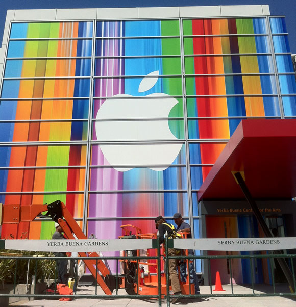
Apple's Yerba Buena Decoration Shows Stretched iOS Icons, Possibly Hinting at Taller iPhone 5

Apple's Yerba Buena Decoration Shows Stretched iOS Icons, Possibly Hinting at Taller iPhone 5:


Photo by Luis Gutierrez, Developer of Super Apps


Apple has finished decorating the front facade of the Yerba Buena center in preparation for their September 12th media event. Apple is expected to announce the iPhone 5 at that event. At initial glance, the front decoration seems to show no obvious clues as to their announcements.


However, one eagle eyed MacRumors forum visitor believes the facade show stretched iOS icons. Zaym points out that you can see stretched versions of iOS icons including Game Center, iTunes, Music and App Store in the image and provides an example image.


After taking the above image and skewing it and shrinking it, we've verified his findings. Several icons are clearly recognizable in their un-stretched form:


Game Center (upside down above), iTunes and Music icons:


Of course, speculation on the reason for the stretched icons points to the long-running rumors that Apple will be introducing a taller iPhone with a 4" diagonal screen. Our complete iPhone 5 roundup details everything we expect in the new iPhone.


Update: Another take on the icons from roosternugget:


Monday, September 3, 2012

อินโฟกราฟฟิกกับนวลขนิษฐ์ พรหมจรรยา ตอนที่1: นำเสนอให้สนองความอยากรู้อย่่างสนุกสนาน

[ที่เห็นและเป็นอยู่] อินโฟกราฟฟิกกับนวลขนิษฐ์ พรหมจรรยา ตอนที่1: นำเสนอให้สนองความอยากรู้อย่่างสนุกสนาน:
ที่เห็นและเป็นอยู่
อินโฟกราฟฟิกกับนวลขนิษฐ์ พรหมจรรยา (ตอนที่1): นำเสนอให้สนองความอยากรู้อย่่างสนุกสนาน
นภพัฒน์จักษ์ อัตตนนท์

กลางสัปดาห์ที่ผ่านมาผมได้ไปเห็นงานชิ้นหนึ่ง ที่เมื่อผมลองได้มีโอกาสได้อ่านได้เห็นแล้วก็นึกเสียดายที่โอกาสที่ได้มาเห็นงานชิ้นนี้ช้าไปหน่อย เพราะเป็นงานที่เกี่ยวข้องกับสภาพการเมืองในช่วงวิกฤตเดือนพฤษภาคม2553 ซึ่งถือว่าเป็นช่วงที่ผมทำหน้าที่รายงานข่าวจากภาคสนามอย่างต่อเนื่อง ซึ่งในหลายๆห้วงเวลาของการรายงานข่าว ผมก็มักจะนั่งนึกถึงวิธีการนำเสนอข้อมูลทางการเมืองเหล่านี้ ให้มีประสิทธิภาพมากขึ้น

2ปีผ่านไปผมเพิ่งได้มาเห็นงานอินโฟกราฟฟิก Political DNA Decoding ซึ่งทำให้ผมสามารถเห็นถึงความถี่ของการใช้คำพูดของสองคู่ขัดแย้งทางการเมืองที่ร่วมวงเสวนาที่สถานบันพระปกเกล้า ในวันที่28มีนาคม2553 ซึ่งแม้ว่าจะเป็นการพบเห็นที่ช้านานมาบ้าง แต่ตัวชิ้นงานก็ยังคงควรค่าแก่การนำเสนอ
“Political DNA Decoding” งานอินโฟกราฟฟิกถอดรหัสการเจรจาในเดือนมีนาคม2553 ระหว่างรัฐบาลกับนปช. โดยนวลขนิษฐ์ พรหมจรรยา

เจ้าของผลงานชิ้นนี้ชื่อนวลขนิษฐ์ พรหมจรรยา (เบลล์) ทำงานเป็นกราฟฟิคดีไซน์เนอร์ ซึ่งตอนนี้เรียนปริญญาโทอยู่ที่มหาลัย Gerrit Rietveld Academy, Sandberg Instituut ภาคการออกแบบ ในเมืองอัมสเตอร์ดัม ประเทศเนเธอร์แลนด์ ซึ่งหลักจากผมใช้เวลาในการแอบดูผลงานของเธอด้วยความสนุกสนานและชื่นชอบในความสรา้งสรรค์ ทำให้รู้ว่านอกจาก Political DNA Decoding เบลล์ยังทำอินโฟกราฟฟิกน่ารักๆแต่เต็มไปด้วยเนื้อหาที่น่าสนใจอีกหลายเรื่อง


เริ่มจากชิ้น
Political DNA Decodingก่อน ไม่ทราบว่ามีที่มาที่ไปอย่างไรครับ?
มันเกิดจากความพยายามในการนั่งดูการเจรจาระหว่างตัวแทนผู้ชุมนุมและรัฐบาลในตอนนั้น สำหรับเรามันแปลกมากที่มีการถ่ายทอดสดทางทีวี เพราะแทนที่จะเป็นการเจรจากันจริงๆ กลับกลายเป็นการสร้างภาพออกสู่สายตาประชาชนมากกว่า พอฟังไป 15 นาทีแรกก็รู้สึกว่า ทนฟังไม่ไหว ต้องปิด แต่คิดไปคิดมาก็อยากรู้ว่าเค้าคุยอะไรกัน หรือแต่ละฝ่ายจะมีแนวโน้มหรือโฟกัสไปทางไหน เลยทำเป็นเกมนับคำขึ้นมา คือฟังไปด้วยนับไปด้วย ว่าฝ่ายไหนอ้างถึงอะไรมากกว่ากัน คำที่คิดไว้จ็จะเป็นกลุ่มคำที่คิดว่าต้องมีการพูดถึงแน่ๆ เช่น ประชาธิปไตย-เผด็จการ ความรุนแรง-ความสงบ ปัญหา-การแก้ไข เลยใช้โปรแกรมเอ็กเซลในการนับ สีแดงแทนฝั่งผู้ชุมนม สีน้ำเงินก็แทนฝั่งรัฐบาล งานที่ออกมาก็เป็นโทนของธงชาติไทยพอดี ใช้เวลาฟังไปด้วยนับไปด้วยประมาณ6ชั่วโมง เหนื่อยมากแต่ก็สนุกดี”
นอกจากPolitical DNA Decoding ยังมีงานอีกหลายชิ้นที่เกียวกับสังคม-การเมือง สนใจการเมืองมาก่อนแล้วหรือเปล่า?
งานส่วนใหญ่ที่พูดถึงเรื่องการเมืองไทยถูกทำขึ้นสมัยปี2553 ตอนนั้นก็เปิดdesign studioเล็กๆอยู่แถวประดิพัทธิ์ รับงานออกแบบกราฟฟิคให้กับลูกค้าทั่วไป พอถึงช่วงที่มีความวุ่นวายทางการเมือง ตอนนั้นค่อนข้างเครียด เศรษฐกิจก็ไม่ค่อยดีอยู่แล้ว ทำอะไรก็ลำบาก ไปไหนมาไหนก็ลำบาก คงรู้สึกเหมือนหลายๆคนที่เป็นคนกรุงว่า นี่มันเกิดอะไรขึ้น สับสน จริงๆแล้วไม่ใช่คนสนใจเรื่องการเมืองเลย เวลาอ่านหนังสือพิมพ์ก็จะเปิดไปหน้าข่าวบันเทิง แต่ตอนนั้นเรื่องมันใกล้ตัวมากจนรู้สึกว่าเรื่องของบ้านเมืองก็คือเรื่องของตัวเรานี่แหละ”


วันที่เป็นจุดเปลี่ยน เกิดขึ้นหลังจากประชุมงานกับลูกค้าเสร็จแถวพญาไท ความสงสัยก็ผลักให้เราเข้าไปเดินดูแถวราชประสงค์ว่าคนที่มาชุมนุมเค้ามาทำอะไรกัน อยากรู้เรื่องอื่นๆนอกเหนือจากที่ข่าวนำเสนอ ตอนนั้นก็ใส่ชุดทำงาน ดูเป็นสาวออฟฟิศมาก ถือกล้องไปด้วย ซึ่งตอนแรกก็กลัว ไม่กล้าคุยกับใคร ร้อนก็ร้อน เดินไปซักพักเลยไปนั่งอยู่แถวสะพานลอย จนมีคุณตาคนนึงเป็นการ์ดนปช.เดินมาชวนคุย บอกว่าเราก็เปิดประเด็นว่าร้อนนะคะ มาอยู่ทั้งวันได้ยังไง ตาแกก็ขำแล้วก็บอกว่าชินแล้วนอนก็นอนนี่ แล้วก็เริ่มคุยกัน แล้วก็ไปถามไปคุยกับผู้ชุมนุมแถวนั้น ส่วนใหญ่ก็ยินดีจะตอบข้อสงสัยของเราว่า พี่มาทำอะไร ไม่เหนื่อยเหรอ โดนจ้างมารึเปล่า หลายๆคำตอบก็เป็นมุมที่ไม่เคยนึกถึงมาก่อน หลายๆอย่างเราไม่เห็นด้วยแต่อย่างน้อยก็ได้เข้าใจมากขึ้น ความรู้สึกแรกเลยที่เปลี่ยนไปคือพอกลับถึงบ้านแล้วดูข่าว ก่อนหน้านี้คนกลุ่มนี้สำหรับเราคือใครไม่รู้ ใส่เสื้อแดง โหด น่ากลัว แต่ตอนนี้ก็รู้สึกว่าในส่วนที่เล็กลงไปกว่ากลุ่มก้อนผู้ชุมนุมในทีวี ก็เป็นคนธรรมดาลุงป้าน้าอาเนี่ยแหละ แย่บ้างดีบ้าง มาด้วยเหตุผลต่างๆกันไป ก็เลยเอาสิ่งที่ได้คุยกันวันนั้นเขียนลงบนบล็อกกระจายให้เพื่อนได้อ่าน”
เลยกลายเป็นที่มาของการทำอินโฟกราฟฟิกเกี่ยวกับประเทศไทยหลายชิ้น
?
“ใช่ค่ะ หลังจากนั้นก็รู้สึกว่าอยากทำอะไรแบบนี้อีก คือพูดถึงสถานการณ์ที่เกิดขึ้น จากมุมมองของเรา นอกเหนือจากสื่อหลักๆที่ดูกันอยู่ทุกวัน ไม่ได้อยากบอกว่าอะไรดีไม่ดี หรือให้เลือกข้างไหน แต่อยากพูดว่าเราเห็นอะไรแล้วให้คนดูได้คิดต่อเอง แล้วก็หลักๆคือไม่อยากให้คนเครียด เลยทำงาน information graphic ชิ้นแรกในชีวิตขึ้นมาชื่อว่า Thailand Colour Code 2010 ที่เอาสีของเสื้อต่างๆที่ปรากฎอยู่ตามข่าว มาจัดกลุ่ม แล้วทำเป็นตารางที่บอกว่า ถ้าคุณใส่เสื้อสีนี้ตอนนี้ คุณจะเป็นคนพวกไหน แต่ก็เน้นให้ขำๆ เช่น ถ้าเลือกไม่ได้ว่าจะเป็นเสื้อเหลืองเสื้อแดง จะเป็นเสื้อส้มไหม หรือเป็นแมคโดนัลด์ ถ้าไม่เข้าข้างใครใส่เสื้อขาว แต่ก็อาจจะโดนคนข้างๆเรียกว่ากลางกลวง หรือจะเป็นคนเสื้อแพงห่วงใยแต่พารากอนก็ใส่แบรนด์เนมกันต่อไป ซึ่งทั้งหมดทั้งมวลก็เป็นมุขที่ได้มาจากสำนักข่าวต่างๆหรือตามอ่านจากในทวิตเตอร์และเฟซบุค”


“Political DNA Decoding” งานอินโฟกราฟฟิกสะท้อนสภาพสหสของสังคมไทย หลังวิกฤติการเมืองช่วงหลายปีหลัง โดยนวลขนิษฐ์ พรหมจรรยา
จาก Thailand Colour Code 2010 ก็มีงานถัดๆมาที่พูดถึงเรื่องที่คล้ายกัน คือ Thailand Fruit Salad 2010 คือไปอ่านเจอว่าใครเขียนถึงว่าบ้านเมืองเราตอนนี้เป็นเหมือนฟรุ๊ตสลัด มีทั้งแตงโม สัประรด มะเขือเทศ ก็คิดว่า เอ้อ มันก็จริงเนอะ เลยเอากระดาษรูปกลุ่มคนนั้นๆมาพับเป็นรูปผลไม้ต่างๆ แต่รวม มะเขือเผา(รัฐบาล) แล้วก็ผักปลา(ประชาชน) เข้าไปด้วย ซึ่งจริงๆจะบอกว่าคนไทยเป็นประเทศที่มีอารมณ์ขันสูงมาก คือถึงจะเครียดแค่ไหนก็จะหามุขมาแทรกได้ ซึ่งสำหรับเรามันก็แปลกดี


“Thailand Fruit Salad 2010” งานอินโฟกราฟฟิกสะท้อนสภาพสหสีของสังคมไทย โดยนวลขนิษฐ์ พรหมจรรยา

อินโฟกราฟฟิก3ชิ้นที่เกี่ยวกับสังคมและการเมืองเป็นเพียงส่วนหนึ่งของงานที่เบลล์ทำเท่านั้น ความจริงยังมีชิ้นงานที่น่ารักและสร้างสรรค์อีกมากมายตามดูกันได้ที่ nuank.com 

ที่เห็นและเป็นอยู่เล่มหน้าจะมาเจาะที่มาที่ไปของดีไซเนอร์คนเก่งที่ผลิตงานเกี่ยวกับสังคมด้วยคนนี้ ในแง่มุมของการทำงานและการออกไปศึกษาในต่างแดน

ฝากทุกท่านช่วยติดตามทำความรู้จักกันครับ

Monday, July 16, 2012

Back to Basics: from paper to paper

Back to Basics: from paper to paper:re-block from Polkadot

Welcome back Eigthies!

Thanks to the creative duo of Zim&Zou (Lucie Thomas + Thibault Zimmermann, both 25 y.o.), a French studio based in Nancy, 80′s style is now alive and fluo in form of paper sculptures. This series, ’80s pieces of design and tech, is one of their best ones in terms of incredible “paper-living” art and color blocking. No words enough to describe the incredible richness of details and the ability in the art of crafting. Don’t miss their whole portfolio: they can easily explore different fields including paper sculpture, installation, graphic design and illustration.


Portraits Using People by Alan Craig


Artist Alan Craig recreates famous iconic photographs with unique giant portraits using aerial photography. Similar to pixels, gatherings of people create these intricately composed portraits. Among some of the portraits recaptured are of the late Elvis Presley, Lucille Ball, and Marilyn Monroe. Most of the people used to create this project are outfitted in dark clothing to contrast easily with the stark white ground used as the back drop. Select areas use color to create a differentiation where the lips are. This massive project changes portrait art on a grand scale.