Pages

Tuesday, October 9, 2012

Amon Tobin ISAM 2.0 – Leviathan

Amon Tobin ISAM 2.0 – Leviathan:Posted on Motionographer


Chicago-based studio Leviathan crafts a creative projection-mapped piece to provide an immersive stage experience for Amon Tobin’s ISAM 2.0 tour.  Check out the making of video here.

Amon Tobin : ISAM case study from Leviathan on Vimeo.

In Black Droplets, the Monochrome LCD Transformed Into Medium

In Black Droplets, the Monochrome LCD Transformed Into Medium:reblog from Create Digital Motion


If previous generations worked in paint, now we can work in monochrome LCDs. That’s the message of a beautiful work entitled IRIS, making use of lowly LCD displays to produce a mirror made of dots. The description:
IRIS is a unique media canvas with matrix of conventional information display technology – a monochrome LCD. Through the phased opening and closing of circular-segmented black Liquid Crystal, IRIS can create various patterns and control the amount (size) of passing lights. IRIS is an interactive medium for visual simplicity which uses the passage of ambient light, not emission of light itself.
Interactive mirrors are a trope in themselves, but I think this piece nicely recalls Daniel Rozin’s “Wooden Mirror,” which lives in the lobby at NYU’s ITP program, a hub in New York of interactive design work. There’s an excellent video document of that piece:

More specs:
Expandable Matrix of Transmissive Monochrome LCD (90x90mm), Custom designed Arduino compatible controller board, DMX512, SPI, Kinect /
It is a selected and supported work of Da Vinci Idea Program(2012) by Seoul Art Space_Geumcheon, KOREA
Another lovely work from HYBE adds interactivity to Dan Flavin’s elegant, minimalist work with lighting tubes:

Full Color LED on custom-designed controller board with Integrated IR Sensor, Acrylic, Stainless Frame. 15(W)x235(H)x38(D)cm /
HYBE’s Light Tree: Interactive Dan Flavin re-illuminates the minimalist fluorescent light tubes of Dan Flavin(1933-1996) from the 1960s, through digital technology. Experimenting with light and its effect, Flavin explored artistic meaning in relationships between light, situation, and environment. The readymade fluorescent light fixtures he used created space divided and adjusted by light and composition, offering a newly structured space with light. HYBE’s work expands the logic of Flavin by reinforcing the physical property of light through interactive media. It presents an escape from traditional lighting, as light and color changes when touched by viewers. Lighting here is divided into front and back, and colors are programmed to maintain complementary colors. The front lighting constantly interacts with colors on a back wall through visual contrast and mixture. A random change and diffusion of light with the involvement of viewers provokes tension extending and segmenting space, turning space into a forum for emotional perceptual experience.

Sunday, October 7, 2012

reblog : Cool Hunting

Cinelli: The Art and Design of the Bicycle

More than 65 years of industry innovation celebrated in a new book

by  in Culture on 1 October 2012

Cinelli-1.jpg
Since Cino Cinelli began building frames in his native Italy in the early 1940s, his name has become synonymous with supreme quality and beautiful design in the cycling world. The innovative Cinelli set the standard in component design in the early days of the ambitious company, pioneering today's common trends. To celebrate the continuously influential company and its rich history, this month Rizzoli will releaseCinelli: The Art and Design of the Bicycle.
Cinelli-3.jpg Cinelli-4.jpg
The 272-page book covers the brand's extensive 65-year history with vibrant images and insightful text by the likes of current Cinelli owner Antonio Colombo, former pro cyclist Felice Gimondi, artist Barry McGee and designer Sir Paul Smith—all passionate enthusiasts. From the invention of the iconic curved fork crown to the brand's illustrious foray into mountain biking and BMX, and eventual unveiling of the bizarrely aerodynamic Lazer frame and Alter stem, the comprehensive book touches on a multitude of contributions to the world of cycling, many of which will come as a surprise to those most familiar with brand's sleek track bikes and recent artist collaborations.
Cinelli-2.jpg
The book does cover those much-loved collaborations as well, including work with San Francisco-based fixed gear gang MASH, artists Benny Gold and Keith Haring and brands like RVCA. Covering the scope of Cinelli's significance from the carefully crafted collaborative projects to the gravity of the brand's R&D outputs, Colombo and the cast of insightful authors provide clear and thorough accounts as appealing to both the knowledgeable enthusiast and the amateur.
Cinelli-Mash 5.jpg
Published by Rizzoli, Cinelli: The Art and Design of the Bicycle will be released 23 October with pre-order available now through Amazon for $34. For a closer look at the beautiful book's inner workings see the slideshow.

DJ Shadow special edition deluxe box set

DJ Shadow special edition deluxe box set: reblog from CR Blog

Above is a digital render of what the special edition deluxe box set of DJ Shadow's forthcoming Reconstructed release will look like. Click through for an exclusive first look at photographs of one of the first to come off the production line...

The release has been designed and art directed by Trevor Jackson in collaboration with Daniel Mason at Something Else who looked after packaging design and production. As well as designing the release itself, the pair also created a pizza-box style shipping carton that feels as much a part of the special edition as its contents:


Inside the box, and snugly stashed in protective foam, lies the release itself which is housed in a super-shiny 6mm thick black acrylic slipcase that sports an engraved graphic that has been infilled with glow-in-the-dark pigment.

The above shot shows how shiny it is (framed pictures on the wall beyond are reflected) and rather nicely the release comes with its own cleaning cloth – like the cloths you get with sunglasses, only larger and, appropriately black.


Inside the slipcase is a white glow-in-the-dark hardback book (above), the inside of which (below) is a symphony of matt black with the eight contained discs (seven CDs and one DVD) housed in the inside front and back covers.

Also included is an individually numbered certificate of authenticity (the release is in a strict edition of 500) signed by DJ Shadow.

The two flippable 'pages' of the book are 12inch sleeves, the first of which is foilblocked (as above) and contains a 12 page gloss laminated and embossed booklet (below) featuring an essay by Dave Tompkins and an illustrated select discography.

The second pocket contains a 180gsm vinyl disc containing a selection of remixes.

"It was a labour of love, took most of 2012 to put together and was one of the most difficult projects I've ever worked on but one I've been the most proud of creating," says Trevor Jackson of the project.
"It's an item that really needs to be seen in the flesh to fully appreciate," he continues, "the attention to detail on every aspect of production has been painstakingly overseen by Daniel Mason at Something Else, and in this increasingly throwaway virtual world it's something an artist of the calibre of DJ Shadow at this point in his career thoroughly deserves."
The special edition is priced at £170 - to find out more, visit djshadow.com.

Monday, September 24, 2012

Apple Introduces Four Television Spots for the iPhone 5

Apple Introduces Four Television Spots for the iPhone 5: With the launch of the iPhone 5, Apple has started running a full slate of television ads promoting the product. Typical with Apple advertising, all the spots focus on the features of the iPhone 5 and iOS, rather than price. They are voiced by Jeff Daniels, currently starring as Will McAvoy on HBO's Newsroom.


One is focused on the new EarPod headphones, while another shows off the new Panorama feature in iOS 6, and a third touts the larger screen of the iPhone 5. The fourth ad shows how the iPhone 5 is the perfect size for "your thumb", a subtle jab at the larger screens of some Android phones that can be difficult to use with one hand.


Monday, September 17, 2012

Willow – Sweater (official video uses MadMapper)

Willow – Sweater (official video uses MadMapper):


While I have already seen examples of augmented reality used in videos before, I really enjoy how this one by Filip Sterckx exploits the idea further in many different ways, with many different angles, that constantly fool my eyes. At the same time the video is constantly reminding you of the fact that ‘this is an illusion’ with visual queues such as the embedded treadmill or the part where the singers legs are ‘buried’ into the stage to create the illusion that he is standing on the water.

Monday, September 10, 2012

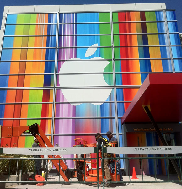
Apple's Yerba Buena Decoration Shows Stretched iOS Icons, Possibly Hinting at Taller iPhone 5

Apple's Yerba Buena Decoration Shows Stretched iOS Icons, Possibly Hinting at Taller iPhone 5:


Photo by Luis Gutierrez, Developer of Super Apps


Apple has finished decorating the front facade of the Yerba Buena center in preparation for their September 12th media event. Apple is expected to announce the iPhone 5 at that event. At initial glance, the front decoration seems to show no obvious clues as to their announcements.


However, one eagle eyed MacRumors forum visitor believes the facade show stretched iOS icons. Zaym points out that you can see stretched versions of iOS icons including Game Center, iTunes, Music and App Store in the image and provides an example image.


After taking the above image and skewing it and shrinking it, we've verified his findings. Several icons are clearly recognizable in their un-stretched form:


Game Center (upside down above), iTunes and Music icons:


Of course, speculation on the reason for the stretched icons points to the long-running rumors that Apple will be introducing a taller iPhone with a 4" diagonal screen. Our complete iPhone 5 roundup details everything we expect in the new iPhone.


Update: Another take on the icons from roosternugget:


Monday, September 3, 2012

อินโฟกราฟฟิกกับนวลขนิษฐ์ พรหมจรรยา ตอนที่1: นำเสนอให้สนองความอยากรู้อย่่างสนุกสนาน

[ที่เห็นและเป็นอยู่] อินโฟกราฟฟิกกับนวลขนิษฐ์ พรหมจรรยา ตอนที่1: นำเสนอให้สนองความอยากรู้อย่่างสนุกสนาน:
ที่เห็นและเป็นอยู่
อินโฟกราฟฟิกกับนวลขนิษฐ์ พรหมจรรยา (ตอนที่1): นำเสนอให้สนองความอยากรู้อย่่างสนุกสนาน
นภพัฒน์จักษ์ อัตตนนท์

กลางสัปดาห์ที่ผ่านมาผมได้ไปเห็นงานชิ้นหนึ่ง ที่เมื่อผมลองได้มีโอกาสได้อ่านได้เห็นแล้วก็นึกเสียดายที่โอกาสที่ได้มาเห็นงานชิ้นนี้ช้าไปหน่อย เพราะเป็นงานที่เกี่ยวข้องกับสภาพการเมืองในช่วงวิกฤตเดือนพฤษภาคม2553 ซึ่งถือว่าเป็นช่วงที่ผมทำหน้าที่รายงานข่าวจากภาคสนามอย่างต่อเนื่อง ซึ่งในหลายๆห้วงเวลาของการรายงานข่าว ผมก็มักจะนั่งนึกถึงวิธีการนำเสนอข้อมูลทางการเมืองเหล่านี้ ให้มีประสิทธิภาพมากขึ้น

2ปีผ่านไปผมเพิ่งได้มาเห็นงานอินโฟกราฟฟิก Political DNA Decoding ซึ่งทำให้ผมสามารถเห็นถึงความถี่ของการใช้คำพูดของสองคู่ขัดแย้งทางการเมืองที่ร่วมวงเสวนาที่สถานบันพระปกเกล้า ในวันที่28มีนาคม2553 ซึ่งแม้ว่าจะเป็นการพบเห็นที่ช้านานมาบ้าง แต่ตัวชิ้นงานก็ยังคงควรค่าแก่การนำเสนอ
“Political DNA Decoding” งานอินโฟกราฟฟิกถอดรหัสการเจรจาในเดือนมีนาคม2553 ระหว่างรัฐบาลกับนปช. โดยนวลขนิษฐ์ พรหมจรรยา

เจ้าของผลงานชิ้นนี้ชื่อนวลขนิษฐ์ พรหมจรรยา (เบลล์) ทำงานเป็นกราฟฟิคดีไซน์เนอร์ ซึ่งตอนนี้เรียนปริญญาโทอยู่ที่มหาลัย Gerrit Rietveld Academy, Sandberg Instituut ภาคการออกแบบ ในเมืองอัมสเตอร์ดัม ประเทศเนเธอร์แลนด์ ซึ่งหลักจากผมใช้เวลาในการแอบดูผลงานของเธอด้วยความสนุกสนานและชื่นชอบในความสรา้งสรรค์ ทำให้รู้ว่านอกจาก Political DNA Decoding เบลล์ยังทำอินโฟกราฟฟิกน่ารักๆแต่เต็มไปด้วยเนื้อหาที่น่าสนใจอีกหลายเรื่อง


เริ่มจากชิ้น
Political DNA Decodingก่อน ไม่ทราบว่ามีที่มาที่ไปอย่างไรครับ?
มันเกิดจากความพยายามในการนั่งดูการเจรจาระหว่างตัวแทนผู้ชุมนุมและรัฐบาลในตอนนั้น สำหรับเรามันแปลกมากที่มีการถ่ายทอดสดทางทีวี เพราะแทนที่จะเป็นการเจรจากันจริงๆ กลับกลายเป็นการสร้างภาพออกสู่สายตาประชาชนมากกว่า พอฟังไป 15 นาทีแรกก็รู้สึกว่า ทนฟังไม่ไหว ต้องปิด แต่คิดไปคิดมาก็อยากรู้ว่าเค้าคุยอะไรกัน หรือแต่ละฝ่ายจะมีแนวโน้มหรือโฟกัสไปทางไหน เลยทำเป็นเกมนับคำขึ้นมา คือฟังไปด้วยนับไปด้วย ว่าฝ่ายไหนอ้างถึงอะไรมากกว่ากัน คำที่คิดไว้จ็จะเป็นกลุ่มคำที่คิดว่าต้องมีการพูดถึงแน่ๆ เช่น ประชาธิปไตย-เผด็จการ ความรุนแรง-ความสงบ ปัญหา-การแก้ไข เลยใช้โปรแกรมเอ็กเซลในการนับ สีแดงแทนฝั่งผู้ชุมนม สีน้ำเงินก็แทนฝั่งรัฐบาล งานที่ออกมาก็เป็นโทนของธงชาติไทยพอดี ใช้เวลาฟังไปด้วยนับไปด้วยประมาณ6ชั่วโมง เหนื่อยมากแต่ก็สนุกดี”
นอกจากPolitical DNA Decoding ยังมีงานอีกหลายชิ้นที่เกียวกับสังคม-การเมือง สนใจการเมืองมาก่อนแล้วหรือเปล่า?
งานส่วนใหญ่ที่พูดถึงเรื่องการเมืองไทยถูกทำขึ้นสมัยปี2553 ตอนนั้นก็เปิดdesign studioเล็กๆอยู่แถวประดิพัทธิ์ รับงานออกแบบกราฟฟิคให้กับลูกค้าทั่วไป พอถึงช่วงที่มีความวุ่นวายทางการเมือง ตอนนั้นค่อนข้างเครียด เศรษฐกิจก็ไม่ค่อยดีอยู่แล้ว ทำอะไรก็ลำบาก ไปไหนมาไหนก็ลำบาก คงรู้สึกเหมือนหลายๆคนที่เป็นคนกรุงว่า นี่มันเกิดอะไรขึ้น สับสน จริงๆแล้วไม่ใช่คนสนใจเรื่องการเมืองเลย เวลาอ่านหนังสือพิมพ์ก็จะเปิดไปหน้าข่าวบันเทิง แต่ตอนนั้นเรื่องมันใกล้ตัวมากจนรู้สึกว่าเรื่องของบ้านเมืองก็คือเรื่องของตัวเรานี่แหละ”


วันที่เป็นจุดเปลี่ยน เกิดขึ้นหลังจากประชุมงานกับลูกค้าเสร็จแถวพญาไท ความสงสัยก็ผลักให้เราเข้าไปเดินดูแถวราชประสงค์ว่าคนที่มาชุมนุมเค้ามาทำอะไรกัน อยากรู้เรื่องอื่นๆนอกเหนือจากที่ข่าวนำเสนอ ตอนนั้นก็ใส่ชุดทำงาน ดูเป็นสาวออฟฟิศมาก ถือกล้องไปด้วย ซึ่งตอนแรกก็กลัว ไม่กล้าคุยกับใคร ร้อนก็ร้อน เดินไปซักพักเลยไปนั่งอยู่แถวสะพานลอย จนมีคุณตาคนนึงเป็นการ์ดนปช.เดินมาชวนคุย บอกว่าเราก็เปิดประเด็นว่าร้อนนะคะ มาอยู่ทั้งวันได้ยังไง ตาแกก็ขำแล้วก็บอกว่าชินแล้วนอนก็นอนนี่ แล้วก็เริ่มคุยกัน แล้วก็ไปถามไปคุยกับผู้ชุมนุมแถวนั้น ส่วนใหญ่ก็ยินดีจะตอบข้อสงสัยของเราว่า พี่มาทำอะไร ไม่เหนื่อยเหรอ โดนจ้างมารึเปล่า หลายๆคำตอบก็เป็นมุมที่ไม่เคยนึกถึงมาก่อน หลายๆอย่างเราไม่เห็นด้วยแต่อย่างน้อยก็ได้เข้าใจมากขึ้น ความรู้สึกแรกเลยที่เปลี่ยนไปคือพอกลับถึงบ้านแล้วดูข่าว ก่อนหน้านี้คนกลุ่มนี้สำหรับเราคือใครไม่รู้ ใส่เสื้อแดง โหด น่ากลัว แต่ตอนนี้ก็รู้สึกว่าในส่วนที่เล็กลงไปกว่ากลุ่มก้อนผู้ชุมนุมในทีวี ก็เป็นคนธรรมดาลุงป้าน้าอาเนี่ยแหละ แย่บ้างดีบ้าง มาด้วยเหตุผลต่างๆกันไป ก็เลยเอาสิ่งที่ได้คุยกันวันนั้นเขียนลงบนบล็อกกระจายให้เพื่อนได้อ่าน”
เลยกลายเป็นที่มาของการทำอินโฟกราฟฟิกเกี่ยวกับประเทศไทยหลายชิ้น
?
“ใช่ค่ะ หลังจากนั้นก็รู้สึกว่าอยากทำอะไรแบบนี้อีก คือพูดถึงสถานการณ์ที่เกิดขึ้น จากมุมมองของเรา นอกเหนือจากสื่อหลักๆที่ดูกันอยู่ทุกวัน ไม่ได้อยากบอกว่าอะไรดีไม่ดี หรือให้เลือกข้างไหน แต่อยากพูดว่าเราเห็นอะไรแล้วให้คนดูได้คิดต่อเอง แล้วก็หลักๆคือไม่อยากให้คนเครียด เลยทำงาน information graphic ชิ้นแรกในชีวิตขึ้นมาชื่อว่า Thailand Colour Code 2010 ที่เอาสีของเสื้อต่างๆที่ปรากฎอยู่ตามข่าว มาจัดกลุ่ม แล้วทำเป็นตารางที่บอกว่า ถ้าคุณใส่เสื้อสีนี้ตอนนี้ คุณจะเป็นคนพวกไหน แต่ก็เน้นให้ขำๆ เช่น ถ้าเลือกไม่ได้ว่าจะเป็นเสื้อเหลืองเสื้อแดง จะเป็นเสื้อส้มไหม หรือเป็นแมคโดนัลด์ ถ้าไม่เข้าข้างใครใส่เสื้อขาว แต่ก็อาจจะโดนคนข้างๆเรียกว่ากลางกลวง หรือจะเป็นคนเสื้อแพงห่วงใยแต่พารากอนก็ใส่แบรนด์เนมกันต่อไป ซึ่งทั้งหมดทั้งมวลก็เป็นมุขที่ได้มาจากสำนักข่าวต่างๆหรือตามอ่านจากในทวิตเตอร์และเฟซบุค”


“Political DNA Decoding” งานอินโฟกราฟฟิกสะท้อนสภาพสหสของสังคมไทย หลังวิกฤติการเมืองช่วงหลายปีหลัง โดยนวลขนิษฐ์ พรหมจรรยา
จาก Thailand Colour Code 2010 ก็มีงานถัดๆมาที่พูดถึงเรื่องที่คล้ายกัน คือ Thailand Fruit Salad 2010 คือไปอ่านเจอว่าใครเขียนถึงว่าบ้านเมืองเราตอนนี้เป็นเหมือนฟรุ๊ตสลัด มีทั้งแตงโม สัประรด มะเขือเทศ ก็คิดว่า เอ้อ มันก็จริงเนอะ เลยเอากระดาษรูปกลุ่มคนนั้นๆมาพับเป็นรูปผลไม้ต่างๆ แต่รวม มะเขือเผา(รัฐบาล) แล้วก็ผักปลา(ประชาชน) เข้าไปด้วย ซึ่งจริงๆจะบอกว่าคนไทยเป็นประเทศที่มีอารมณ์ขันสูงมาก คือถึงจะเครียดแค่ไหนก็จะหามุขมาแทรกได้ ซึ่งสำหรับเรามันก็แปลกดี


“Thailand Fruit Salad 2010” งานอินโฟกราฟฟิกสะท้อนสภาพสหสีของสังคมไทย โดยนวลขนิษฐ์ พรหมจรรยา

อินโฟกราฟฟิก3ชิ้นที่เกี่ยวกับสังคมและการเมืองเป็นเพียงส่วนหนึ่งของงานที่เบลล์ทำเท่านั้น ความจริงยังมีชิ้นงานที่น่ารักและสร้างสรรค์อีกมากมายตามดูกันได้ที่ nuank.com 

ที่เห็นและเป็นอยู่เล่มหน้าจะมาเจาะที่มาที่ไปของดีไซเนอร์คนเก่งที่ผลิตงานเกี่ยวกับสังคมด้วยคนนี้ ในแง่มุมของการทำงานและการออกไปศึกษาในต่างแดน

ฝากทุกท่านช่วยติดตามทำความรู้จักกันครับ

Thursday, August 30, 2012

Beyonce at the UN: Behind the Scenes of Epic Projection in the General Assembly Hall [Gallery]

Beyonce at the UN: Behind the Scenes of Epic Projection in the General Assembly Hall [Gallery]:

The new world of projection is big – really big. Planet big. It’s not a dinky projector pointing at a ragged, wrinkled piece of cloth. It’s something that can stand up to one of the world’s great divas.
When you’ve got Beyoncé, and you’ve got the General Assembly Hall of the United Nations in New York City, you’re on a whole new level. Lucas Werthein of SuperUber is kind enough to share with Create Digital Motion the effort that made this all possible. And, we have a photo gallery revealing how all of this came together.

First, he rattles off some of the impressive specs:
Projection
  • We used 10 20K HLM Barco projectors
  • Mapping was done using Pandora’s widget designer and 5 Pandora’s Box Dual servers
  • The final video has a 8856 x 1664 resolution
  • This final video was split into 10 slices of 1080 x 1664 pixels, since each projector was turned on its side and we projected the images vertically in order for them to cover the whole structure. We fed 2 slices into each system and did the warping and edge blending inside Pandora

Screen
  • The screen is over 12,000 square feet
  • It is the largest indoor temporary screen that is a tilted compound curve. From an engineering standpoint, it is extremely complex.
  • It took a team of 45 people to sew the screen.
  • It weighs 1000 pounds. The whole structure, which was hanging off the the UN ceiling weighed 6000 pounds
  • In order to create the proper tension for the screen to hold its shape we had to weld permanent rigging points into the dome of the general assembly.
This is projection mapping, though onto a fairly simple surface. What makes the mapping so effective is the way in which it can fill the space, making those pictures immersive on a grand architectural scale. It makes the image a real volume in which the performance can take place.
The content itself might draw some criticism. The event celebrates the World Health Organization’s World Humanitarian Day, humanitarian efforts and social causes. The imagery, featuring groups like the Red Cross, tends to more traditional aid – this is people in corners of the world being helped by someone else’s hand, rather than helping themselves. But that’s what powerful projection can do: it can make imagery big enough that it invites big thinking — and debate. Even amidst the spectacle here, that kind of powerful immersion can lead people to engage with what images mean, enlightened in a brilliant glare rather than lost in dimmed obscurity. (And, for the record, with an interactive component, the WHO in this case also invited direct commentary on what social action can mean.)
In the end, you see a performance in which neither Beyoncé nor the imagery upstages the other – it’s two powerful performances, not just one.
SuperUber offers more description, which also puts those animations and images in better context.
SuperUber was invited to direct the technology, screen, and stage design for Beyoncé’s single “I Was Here”. The filming took place on Friday, August 10th, during a live performance for special guests in the General Assembly Hall of the United Nations in New York.
The music video is part of the global World Humanitarian Day campaign, which honors humanitarian efforts worldwide and encourages people to engage in social causes. The worldwide release took place on Sunday, August 19th, and 1 billion messages were shared through social media (whd-iwashere.org).

SuperUber’s role included the integration between animations and technology, the structure design and projection mapping that took over the United Nations General Assembly Hall.
It is the largest indoor compound curved screen ever created – a complex and sophisticated project. It was custom-designed to mold to the inside of the General Assembly Hall. The screen spanned 224 ft X 46 ft (68m X 15m) and surrounded the audience with a 240 degree immersive projection. Ten synchronized and mapped projections covered the screen with 200,000 lumens, creating one continuous giant image.
“It’s an ambitious project that has completely transformed an iconic location – seen as immutable and unchanging, with its goldplated panel and grand volume. By adding a virtual layer to it, we could digitally rebuild it, playing with the architectural elements, and therefore changing the notion of something static. The technology made the integration between animation and architecture. We used projectors to “paint with light” the UN General Assembly’s Hall – a unique opportunity to transform such an emblematic place,” said Russ Rive, SuperUber’s director.

SuperUber was invited by Kenzo Digital, director of numerous acclaimed productions, amongst them Beyoncé’s “Run The World (Girls)” performance at the Billboard Music Awards in 2011. The “I Was Here” performance was directed by Kenzo Digital, in association with Droga5, Ridley Scott Associates (RSA), SuperUber, and Dirt Empire.
SuperUber is an agency, tech lab, and architectural studio working across media and interactive projects, with offices in Rio de Janeiro, São Paulo, and New York
http://superuber.com


Wednesday, August 8, 2012

Philips Thinks We Want a Giant Wave of LED Panels, Controlled By iPad – And They’re Correct

Philips Thinks We Want a Giant Wave of LED Panels, Controlled By iPad – And They’re Correct:


LivingSculpture 3D module system from WHITEvoid on Vimeo.
Visualism has gone far beyond just projection. Lighting continues to dazzle, blurring the lines between the image, object, pixel, and display, as LED panels produce new three-dimensional forms and animation.
In a spectacular project for lighting giant Philips, Berlin-headquarted White Void, the interactive shop led by Christopher M. Bauder, produces a giant wave of screens, all controlled via iPad. (Bauder you might recall from a collaboration with Robert Henke, featured on Create Digital Music in 2009 in view and interview, in stunning, fanciful arrays of mechanized balloons and accompanying electronic score.)
Details:
The “LivingSculpture 3D module system” is the latest addition to the Philips “LivingSculpture” product family. WHITEvoid designed a modular plug and play OLED system that allows for infinite variations in layout and arrangement of a ceiling or wall lighting installation. The highly flexible system consists of an online configurator to create and order the individual arrangement, a plug and play modular hardware system and an iPad controlled light animation application.
It’s sumptuous, immersive, sculptural eye candy. (I’m filing this in my Neo-Baroque file.)
at whitevoid.com
And yes, Philips, I’d like one for my evil lair once I come up with some truly unethical way of building one. In the meantime: LED’s future is bright for visual artists, no question.